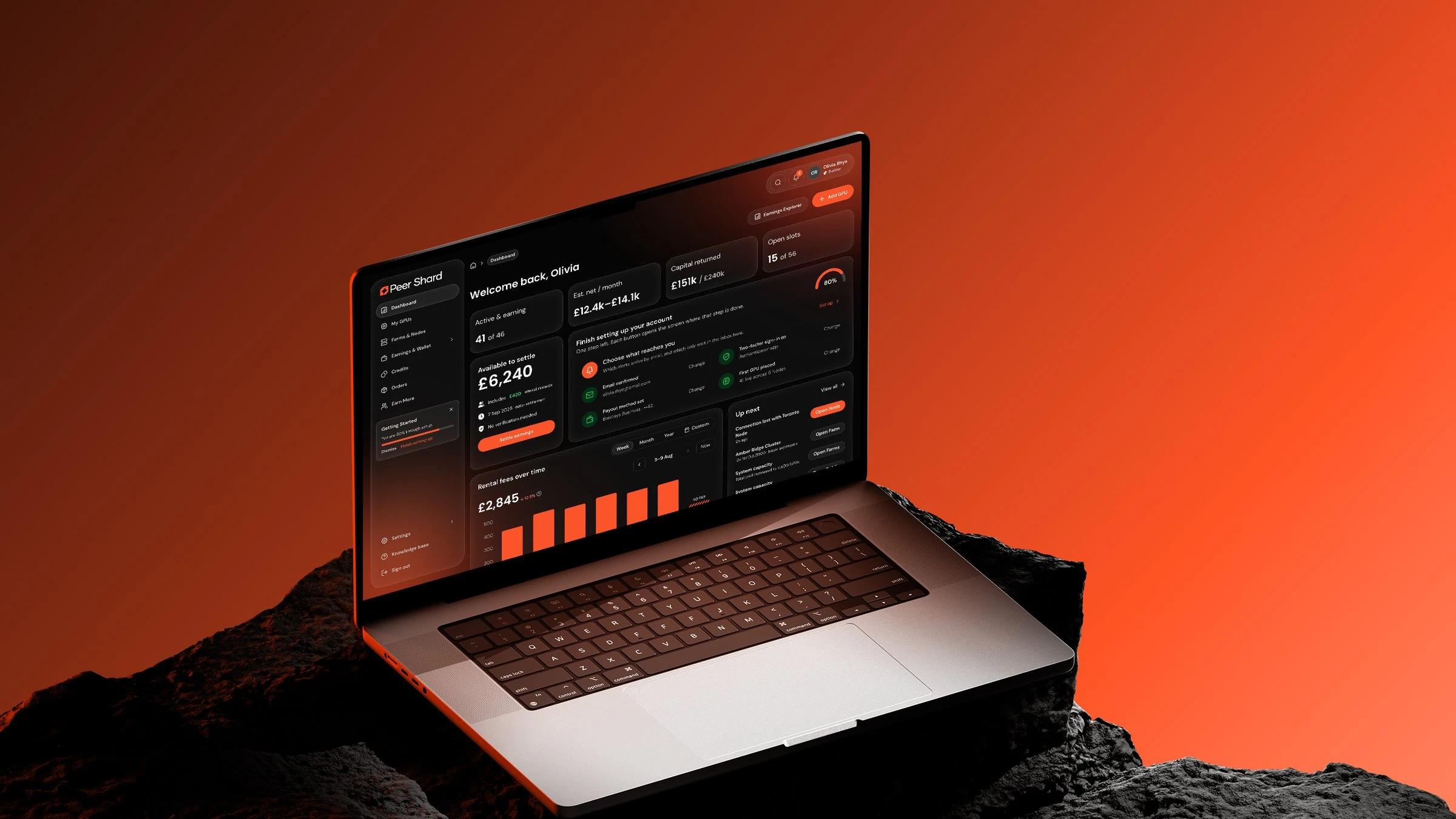
Sylo
An iOS fitness app that tracks food, runs and camera-counted workouts under one daily score
- 2026
- Senior Product Designer
- Solo, one senior product designer
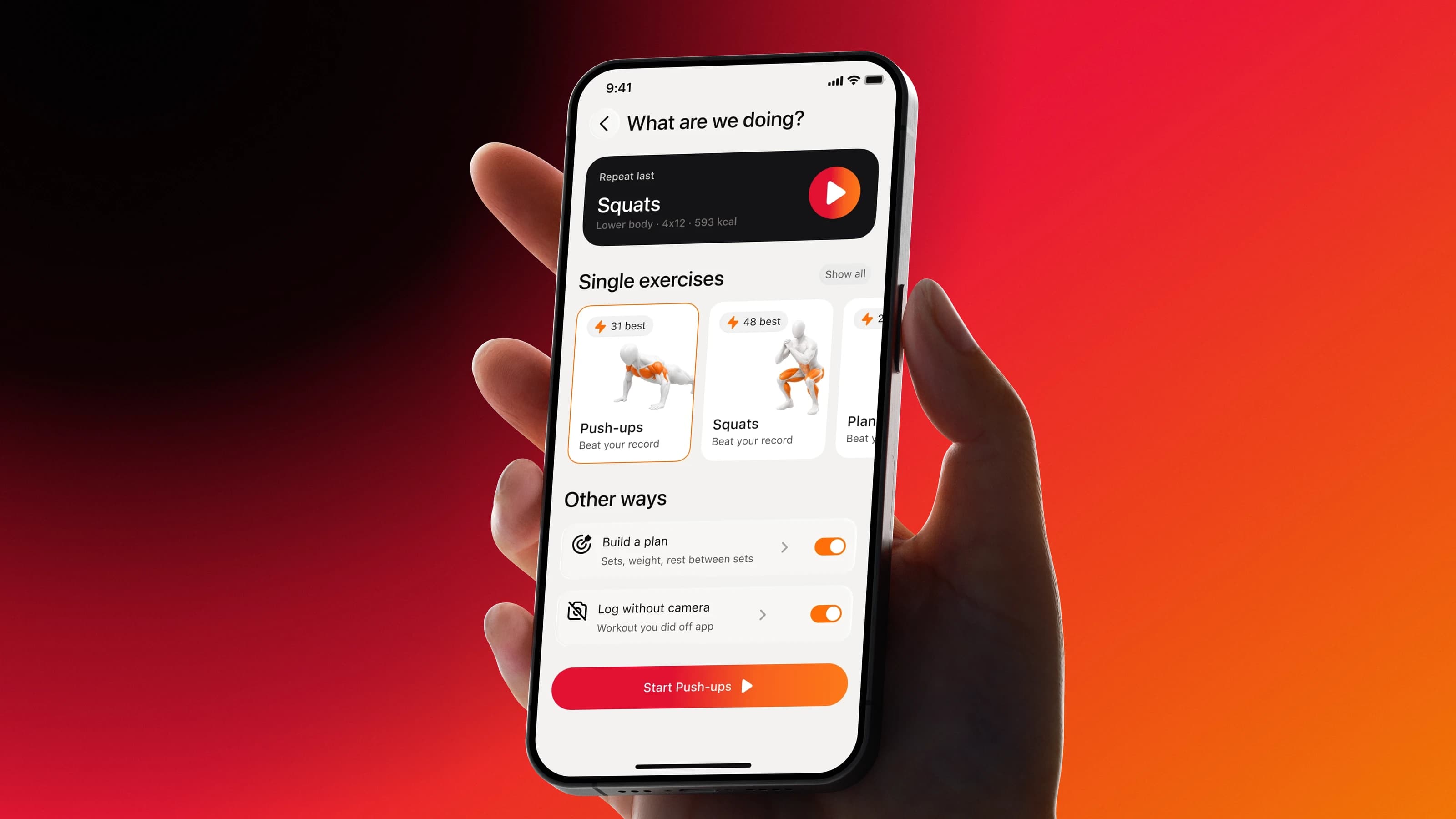
The task. Sylo is an iOS app for people who track their health in more than one place. Food and macros, runs with GPS and strength workouts where the phone camera counts reps sit under one subscription and one daily score from 0 to 100, with an AI coach on top. The founder had a working TestFlight build and asked for a fast redesign of the screens after onboarding: fix the obvious UX roadblocks and give the app one visual system.
What I did. Market research, personas and user stories, a mini audit of the build, UX fixes on Run and Workout, a design system, then the redesign of the dashboard, workout planning, empty states, profile and history.
The result. Everything in the redesign shipped to production.
- Two to three weeks
- The camera
Sprint
The sprint took two to three weeks with a fixed scope, so the first decision was where the design hours go. They went to the screens that drive activation and retention: Home, Run and Workout.
- Personas and user storiesMini auditUX fixesDesign system
- DashboardWorkoutEmpty states
- Secondary screensVisual QAHandoff
Onboarding, dark mode, prototypes and illustrations stayed out of the sprint. Posture tracking and rep counting belonged to the developers, and I left UX comments on them.
Market
Sylo sells against a stack of specialised apps: Strava for runs, MyFitnessPal or MacroFactor for food, Hevy or Fitbod for lifting. Before touching the screens I went through what users of those apps and of camera fitness products complain about on Reddit, and through the RevenueCat benchmarks for Health & Fitness.
- Camera tracking
- All-in-one
- Daily score
- Food logging
- Subscription
- Trends
Personas
The three personas cover the three pillars of the app. Each one uses Sylo in a different rhythm, and that rhythm decided what goes first on the screen.
Emily
When I am chasing a specific number on the scale, I want Sylo to calculate how much to eat and move today.
Marcus
When I train without a partner, I want Sylo to count reps and time via the camera.
Ryan
When I run, I want Sylo to record the route, distance and pace, so I can see real progress over time.
Beta audit
I walked through the beta as a new subscriber opening the app for the first time, step by step through the jobs of the three personas. Then I checked every screen against Nielsen's ten heuristics and rated each problem.
- 1
- 2
- 3
- 4
- 5
- 6
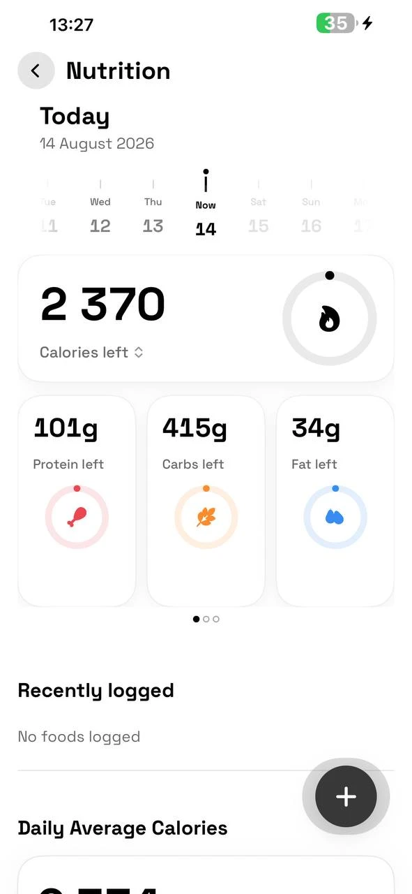
Nineteen problems in total, none of them critical. The six in the table are the majors. Log weight with a live BMI and Log sleep came out as the best screens in the app. The pattern behind most majors was the same: a placeholder zero looked exactly like real data.
Hypotheses
- If adding a meal and logging weight sit on Home in one tap, Emily logs more often in her short sessions.
- If the score shows how much of the day is left next to the number, a low morning score stops reading as failure.
- If Start new is the first thing on Run, a new user starts the first run instead of reading two empty messages.
- If Start new workout offers the last session first, Marcus starts a regular workout without building it again.
Home
Home has to answer two questions at a glance: how the day is going and what to do next. The score card now shows the status and the time left, so 23 out of 100 comes with 8h 37m to catch up. Rings for nutrition, steps and sleep show what the score is made of, and the coach insight names one step with a number.
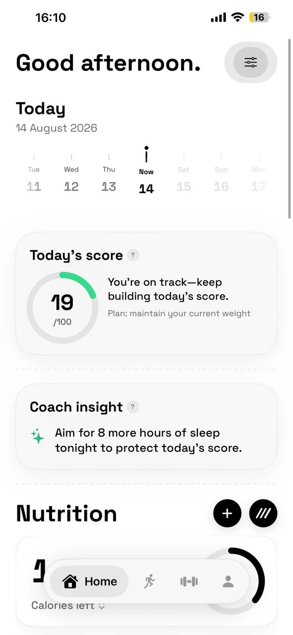
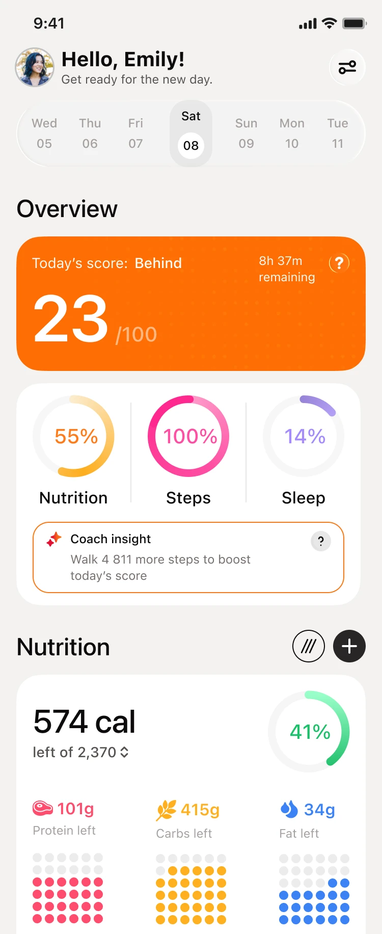
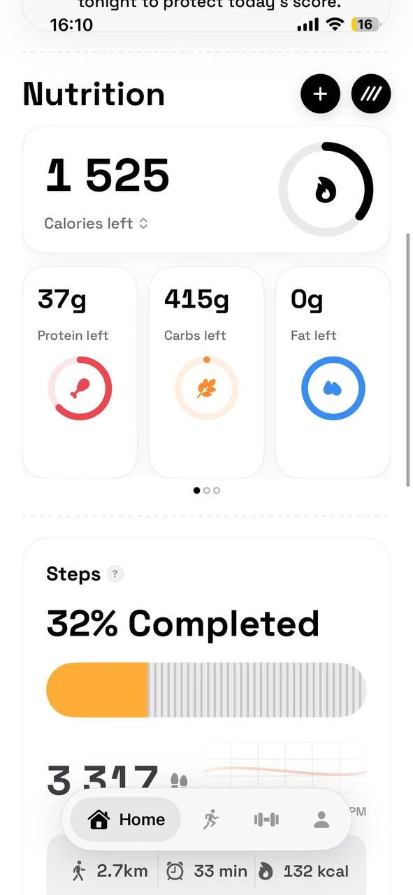
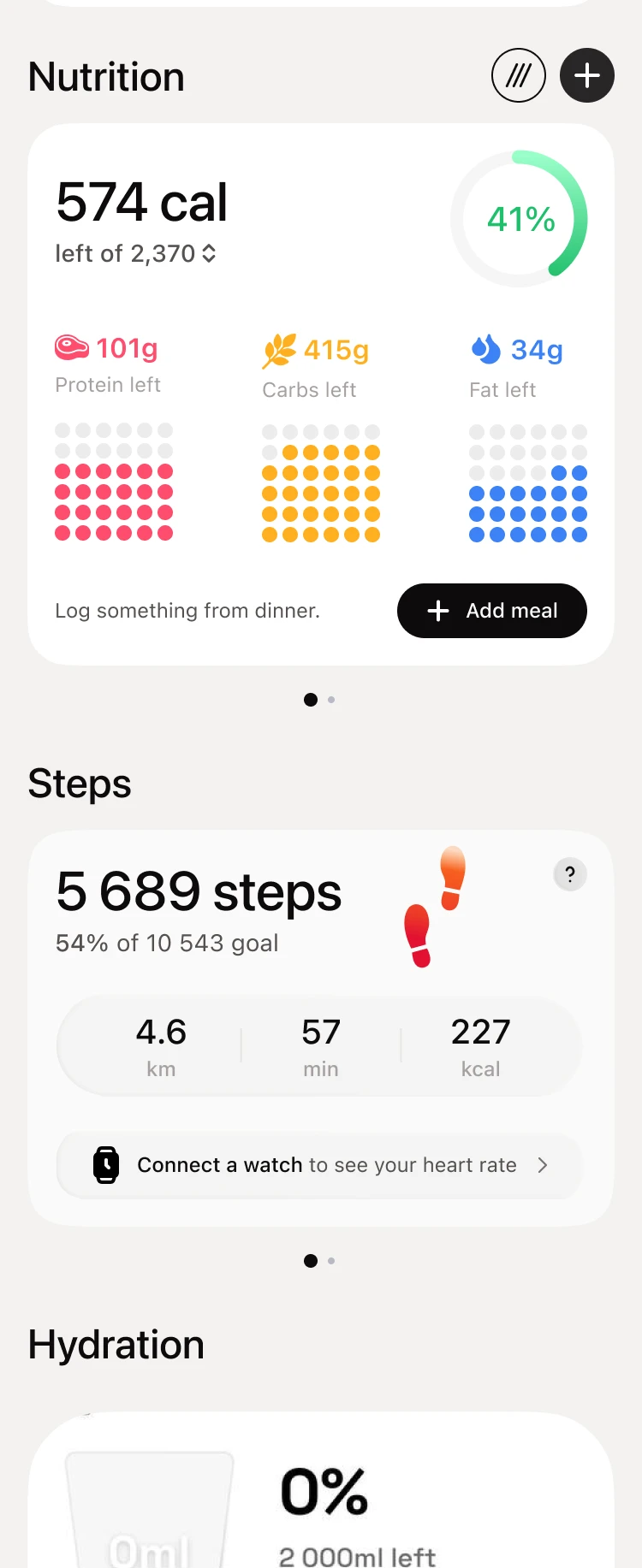
The cards took the audit findings. Add meal sits on the nutrition card, so Emily logs dinner without leaving Home. The steps card shows the goal, which the old Home hid, and offers to connect a watch where the heart rate would be.
Metric screens
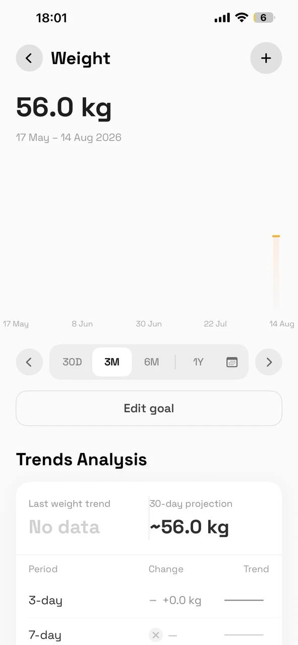
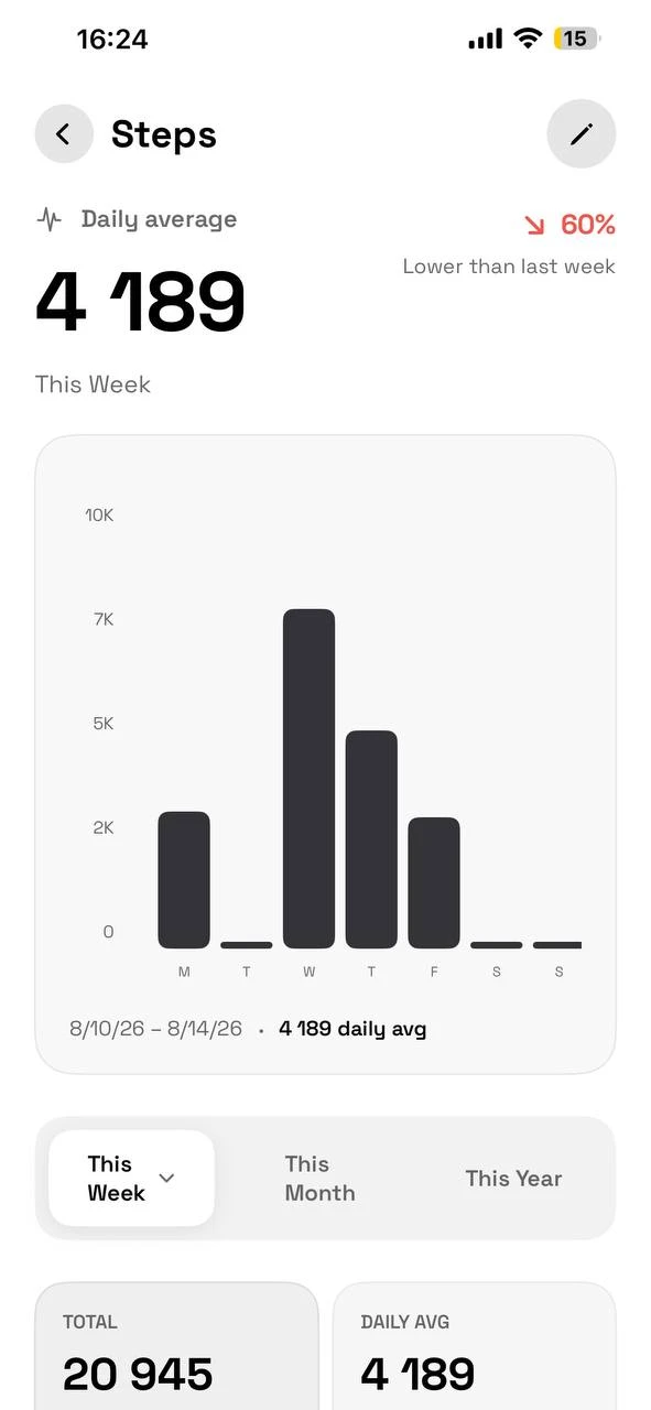
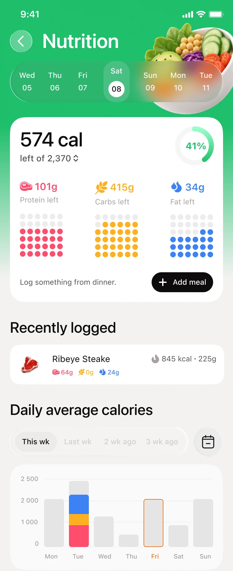
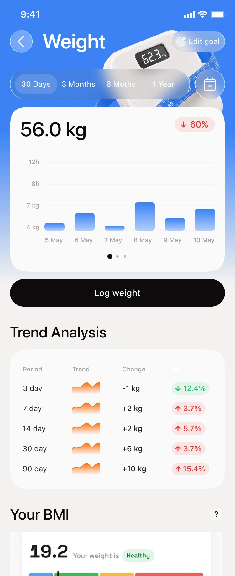
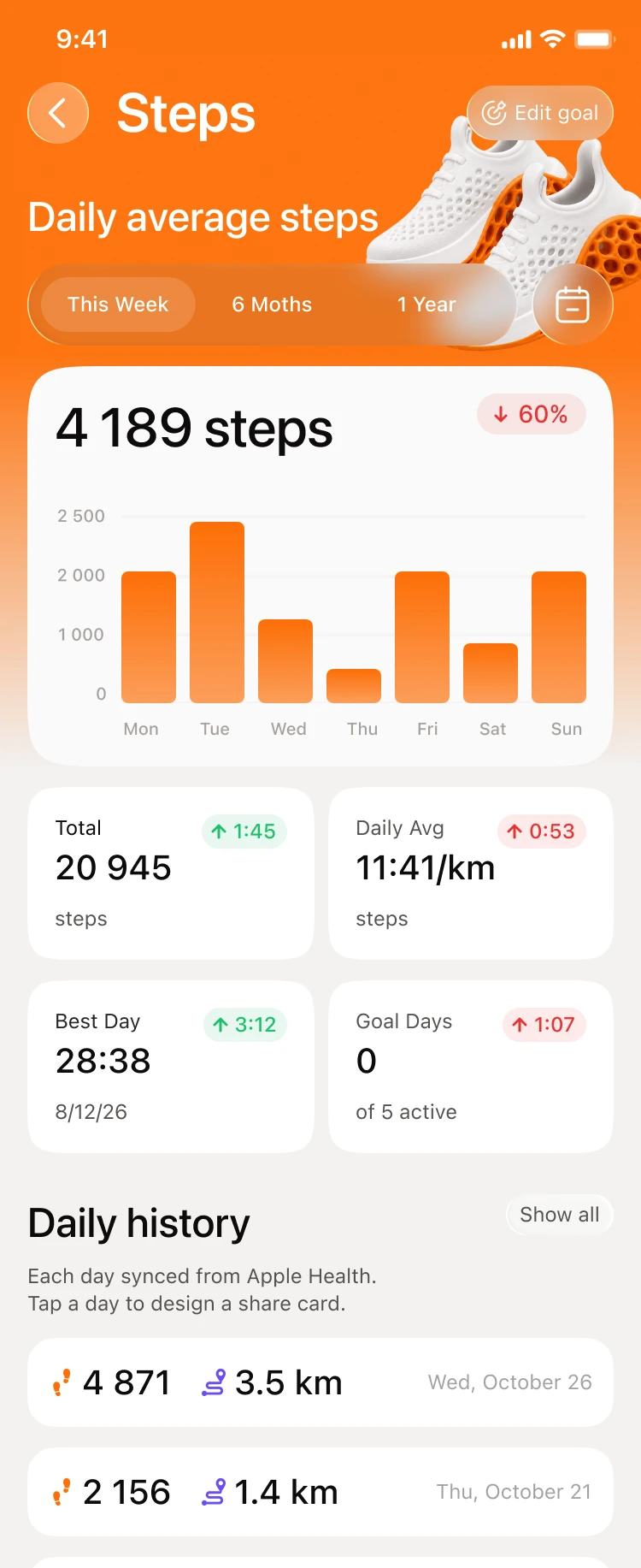
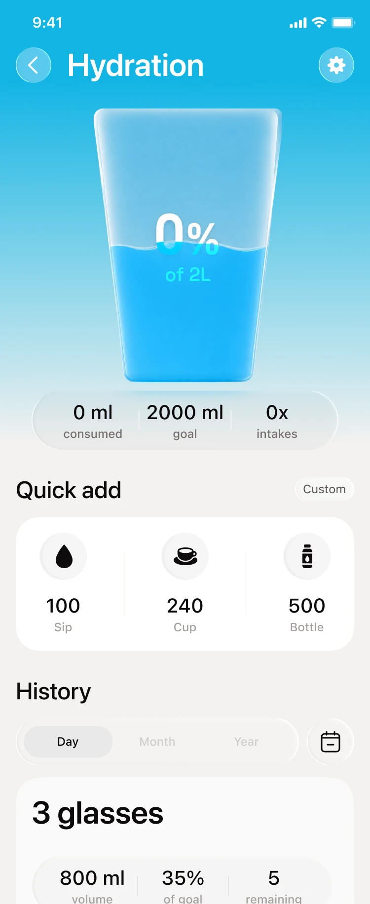
Each metric got its own color and a header with a 3D object: green for nutrition, blue for weight, orange for steps, light blue for hydration. The screens share one layout of period, chart, main action and trends, so the second one is already familiar.
Run
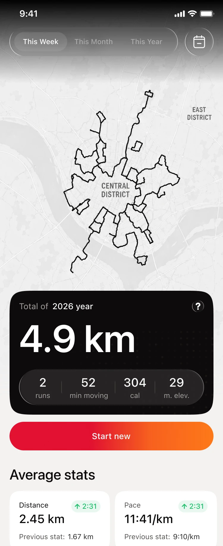
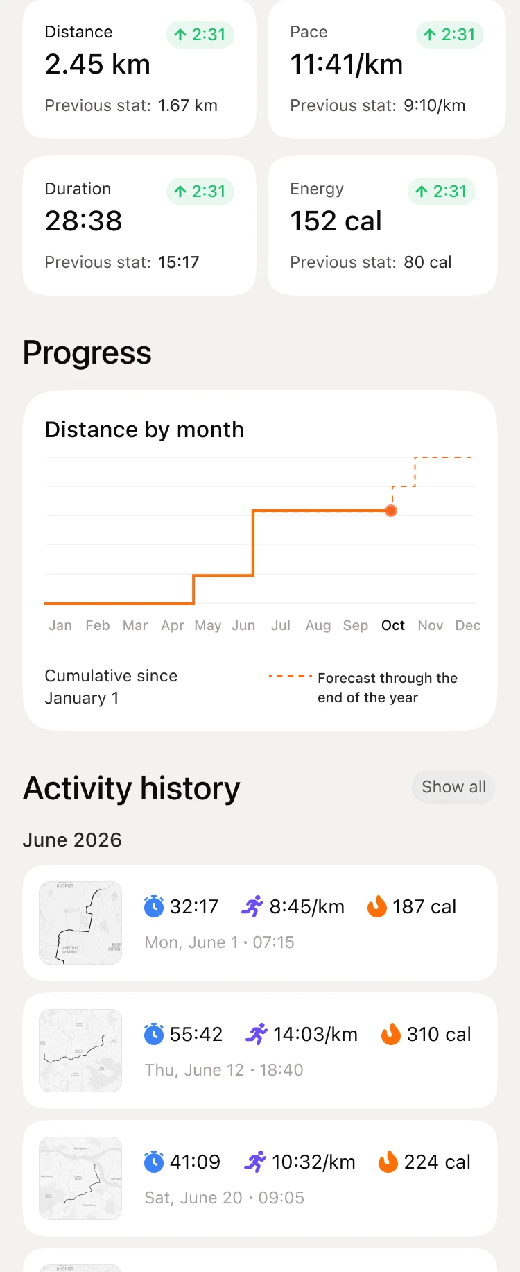
For a new runner the old Run opened with a blurred map and two "no data" messages before Start new. Now the route map, the total for the year and Start new fit on the first screen. Stats, monthly progress and history go below.
Workout
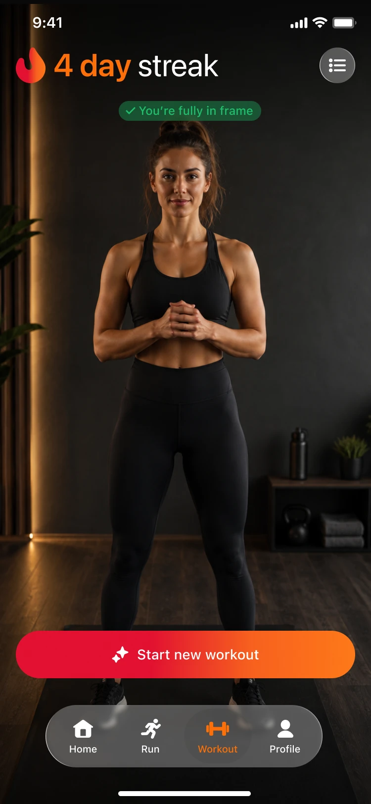
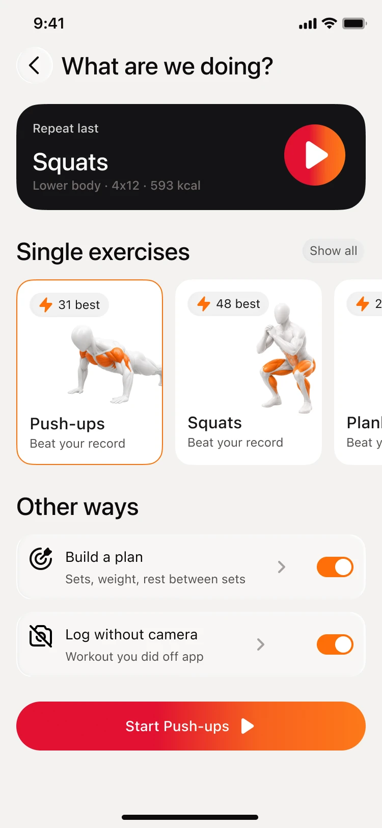
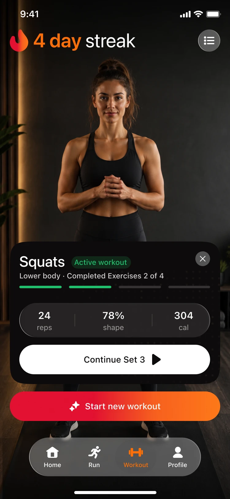
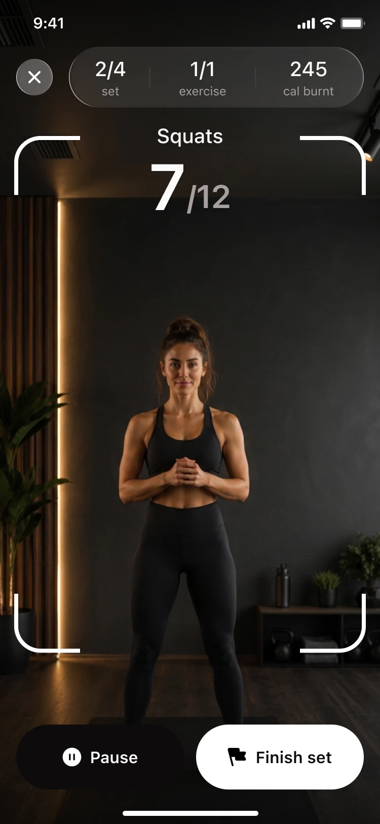
Marcus opens Workout to train, so the tab starts with the camera on and a check that the whole body is in frame. Start new workout leads to a short choice: repeat the last session, pick one exercise, build a plan or log a workout done without the camera.
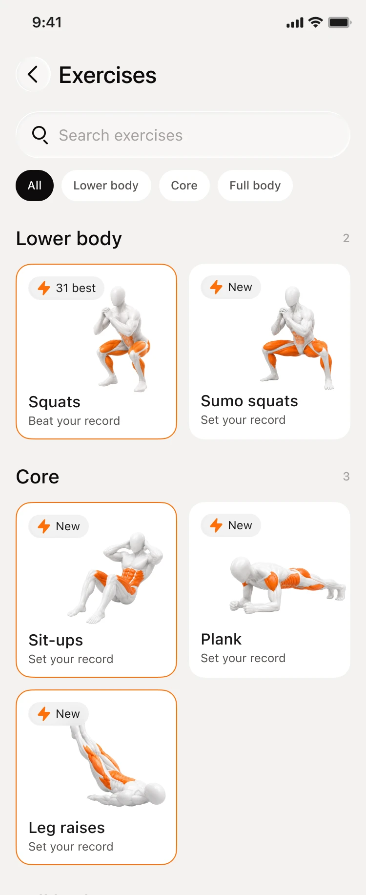
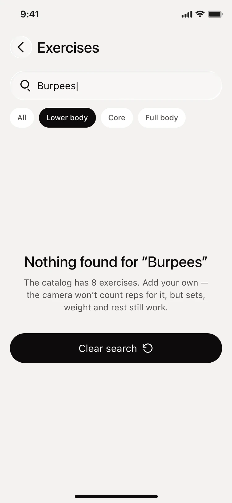
The catalog groups exercises by body part, and each card shows the personal best or New. An empty search explains that the catalog has eight exercises and that a custom one keeps sets, weight and rest without rep counting.
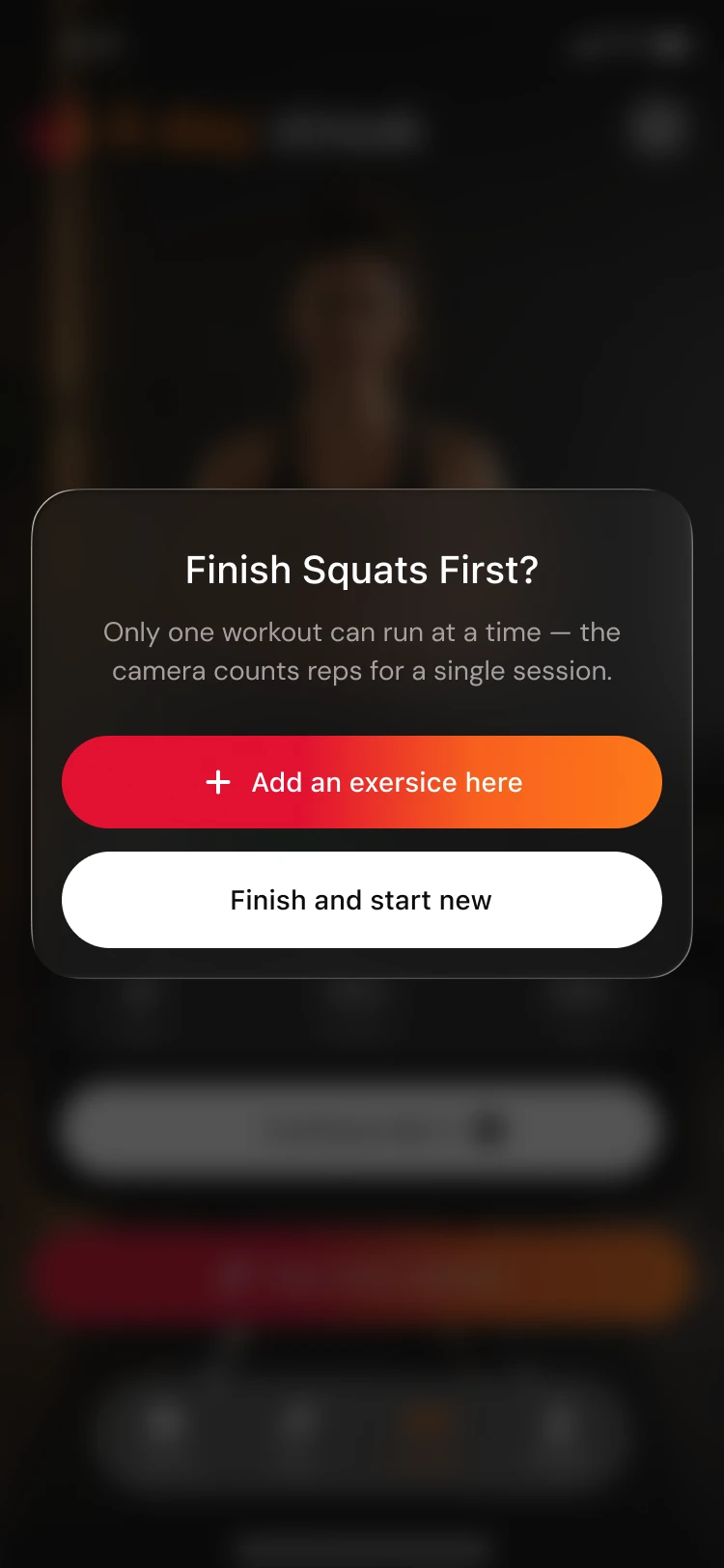
During a set the camera counts reps against the target. Between sets the card shows reps, shape and calories with Continue Set 3. The camera counts one session at a time, so starting a second workout asks to finish the first.
Results
- 2–3 weeks
- From the beta audit to the handoff
- 19
- Problems found in the beta, six of them major
- 5
- Metric screens on one layout
- 4
- Hypotheses, each measured from a tap
Everything in the redesign shipped to production.
Home. The score comes with its status and the time left in the day. The coach insight gives one step with a number, and a meal goes in straight from the nutrition card.
Metric screens. Nutrition, Weight, Steps, Sleep and Hydration share one layout, each in its own color.
Run. A new runner sees Start new on the first screen, and the stats and history sit below the map.
Workout. The camera checks that the whole body is in frame before the start. A workout can be repeated, picked from the catalog, built as a plan or logged without the camera, and only one runs at a time.
Handoff. The developers got an organized Figma file with the component library, plus UX comments on posture tracking and rep counting.
The numbers are still being collected, and the four hypotheses will be checked against them.