KIKI
How sign-up turned into activation on a two-sided marketplace
- 2026
- Product Designer
- Kiki Media
The task. KIKI is a two-sided marketplace for influencer marketing. Brands post paid promotion orders, creators take them, shoot a video and get paid. The client came with a precise complaint: people sign up and disappear, and the acquisition budget pays for accounts that never do anything.
What I did. Sign-up and the first experience for both roles: an audit of the old flow, the funnel split by role, calls with people who left, hypotheses, wireframes, a prototype tested with live users, and two onboarding branches at 1440 and 360.
The result. Sign-up completion grew by 20–25%. Activation, the share of people who reach their first key action, grew by 15–20%.
- Budget and deadline
- Hero UI
- Russian-market sign-in
Two-sided marketplace
Brands come for a finished campaign, creators come to earn. After sign-up both landed on a board with real, paid orders, and still left. The content was there. The mechanics were unreadable: you see an order, but you can't tell whether you may take it, what counts as done and when the money arrives.
So I set the success criterion on activation: a brand posts its first campaign, a creator takes an order and delivers a video.
Research
Research took the most time in this project. I started by going through sign-up myself as a new user and wrote the problems up for the team.
- No way in
- The code never arrived
- Money lost in 30 seconds
- Trust breaks early
The profile step added its own friction. A required unique nickname could greet a newcomer with “this name is already taken” before they saw anything. And the role was asked on the very first screen, before the person saw any value, although someone who shoots videos today may want to order promotion tomorrow.
Then I rebuilt the funnel in Yandex Metrica and split it by role. Brands and creators stalled in different places, so the product needed two solutions.
Brands
- Came for
- Stalled on
- First key action
Creators
- Came for
- Stalled on
- First key action
Analytics showed where it broke, but not why. For that we called people from both sides who signed up and never came back.
- The interface wasn't the problem
- Orders readable, mechanics hidden
- Explain the model first
Competitor onboarding
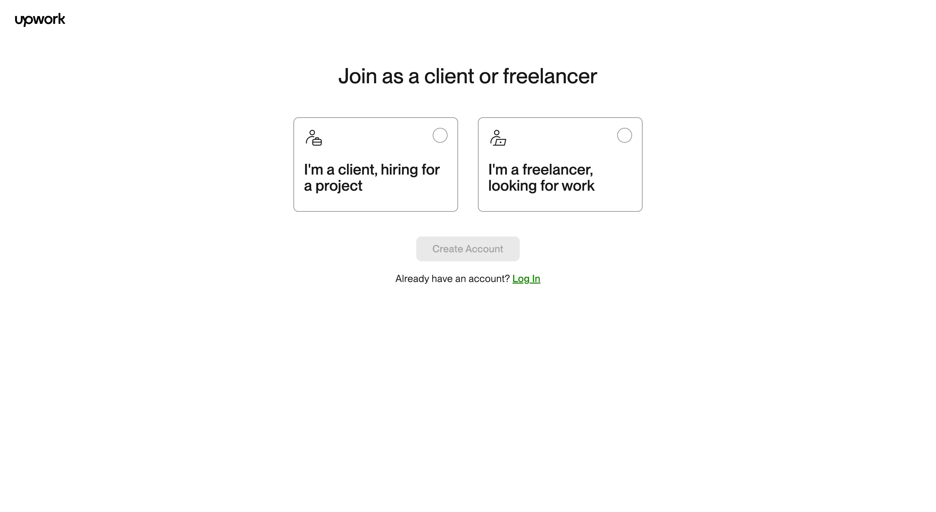
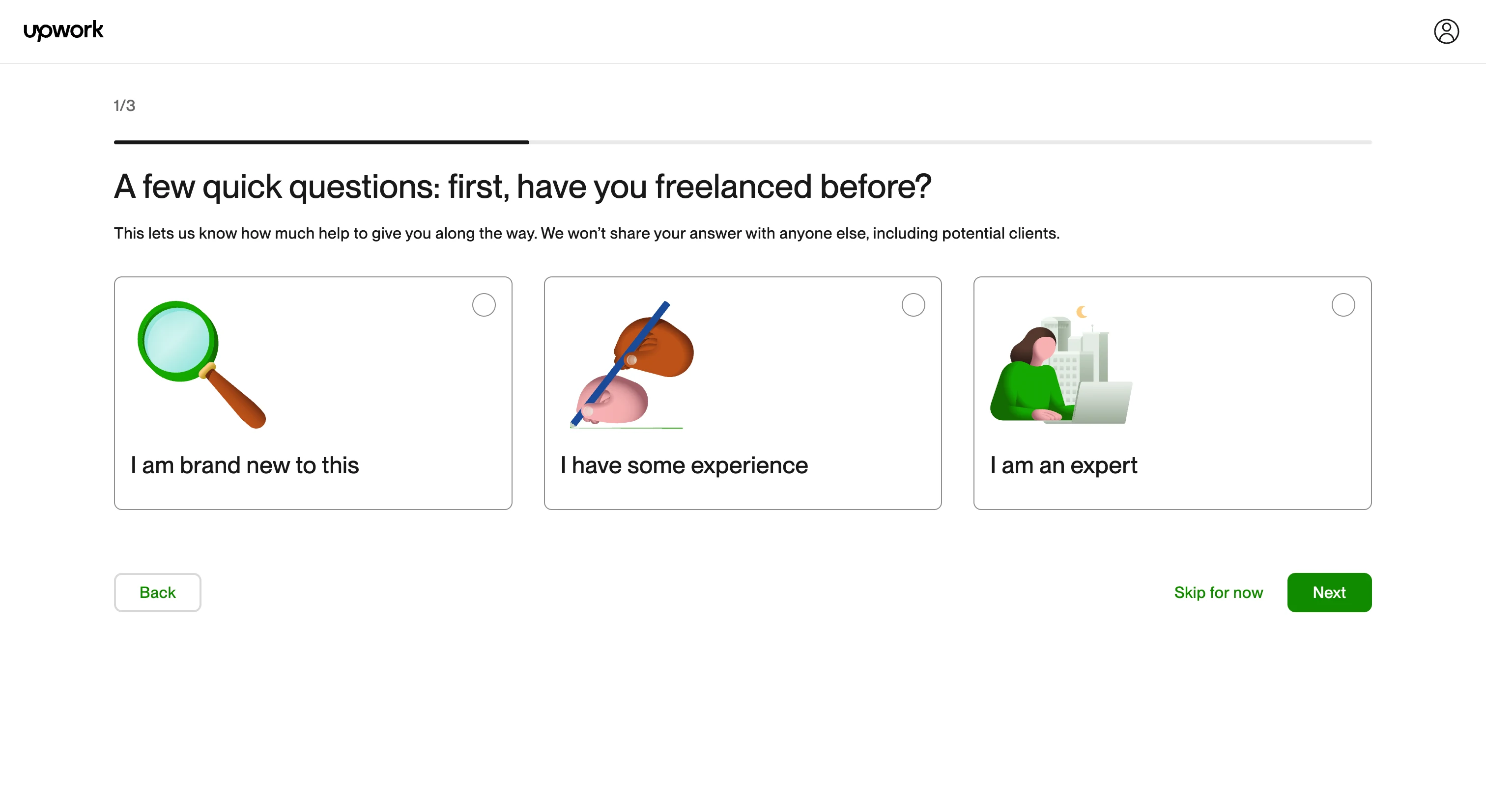
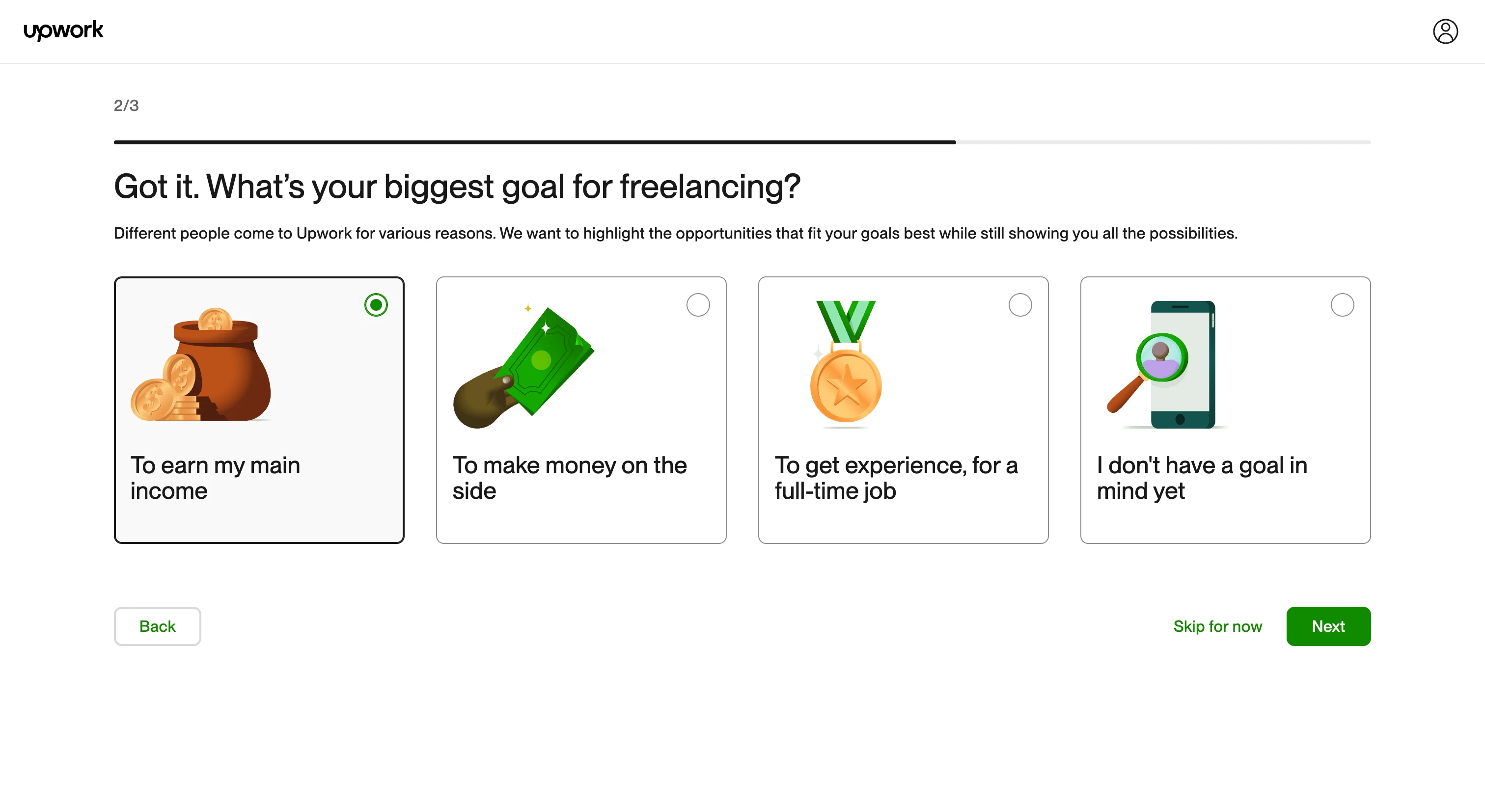
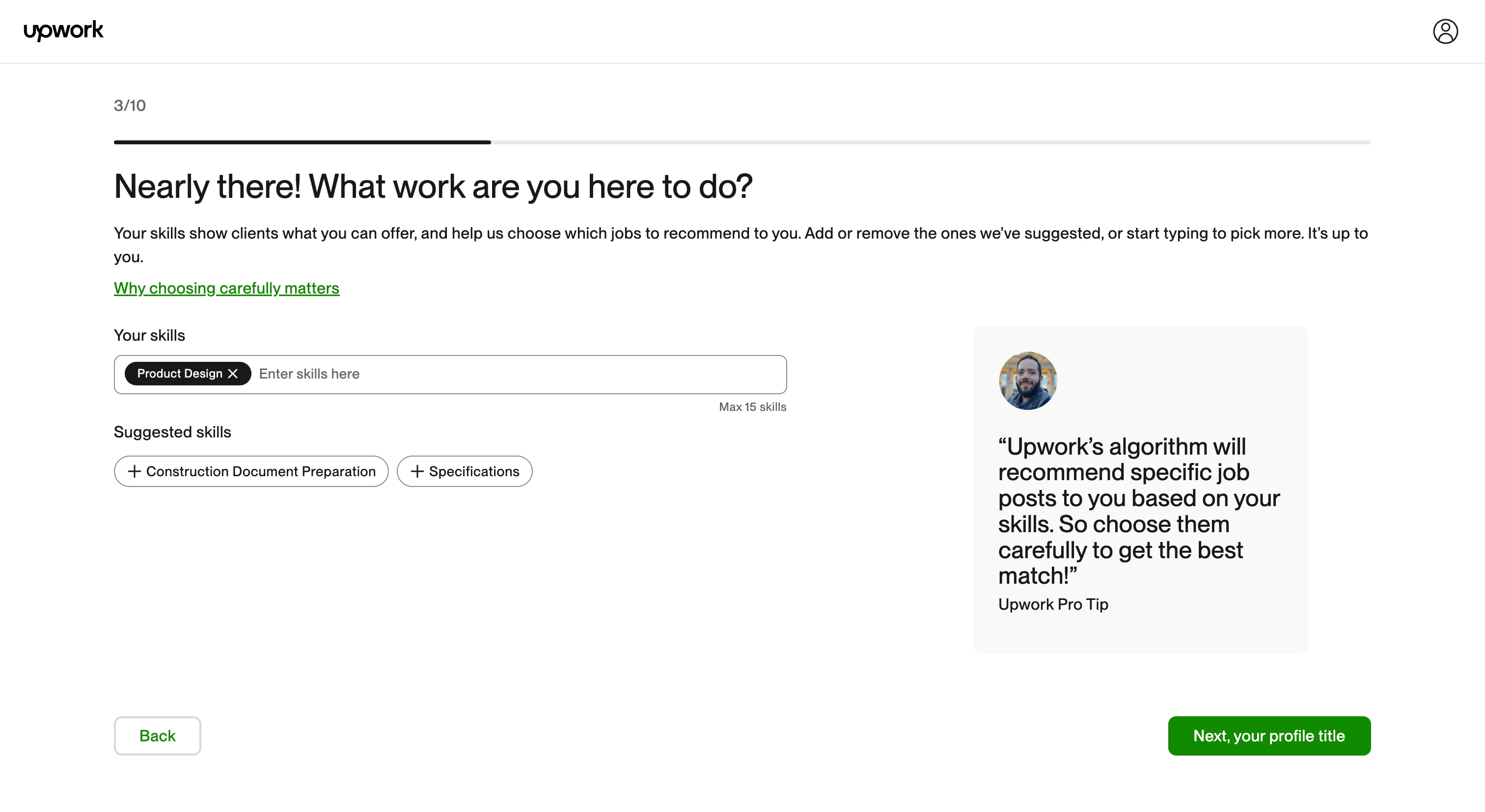
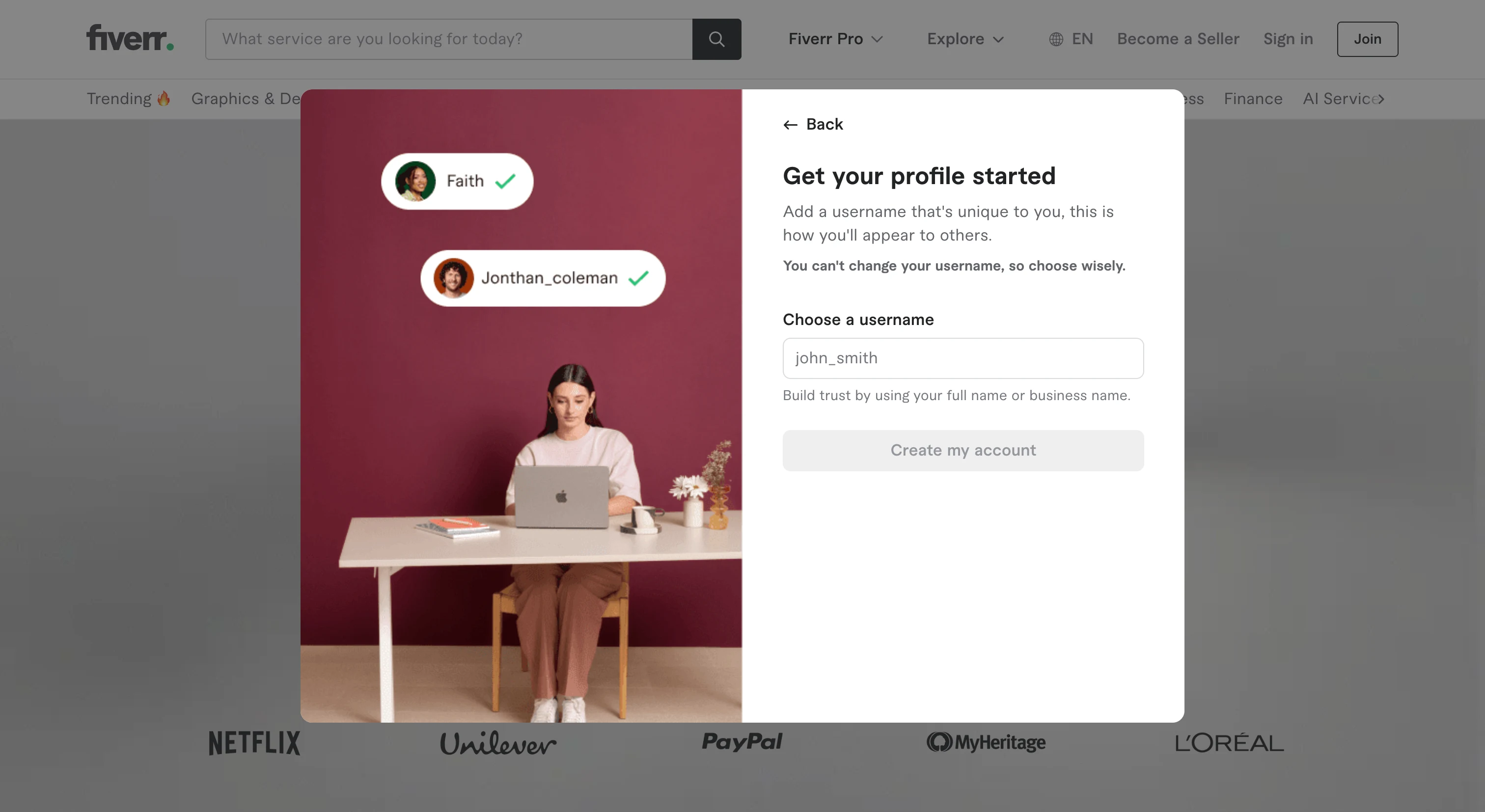
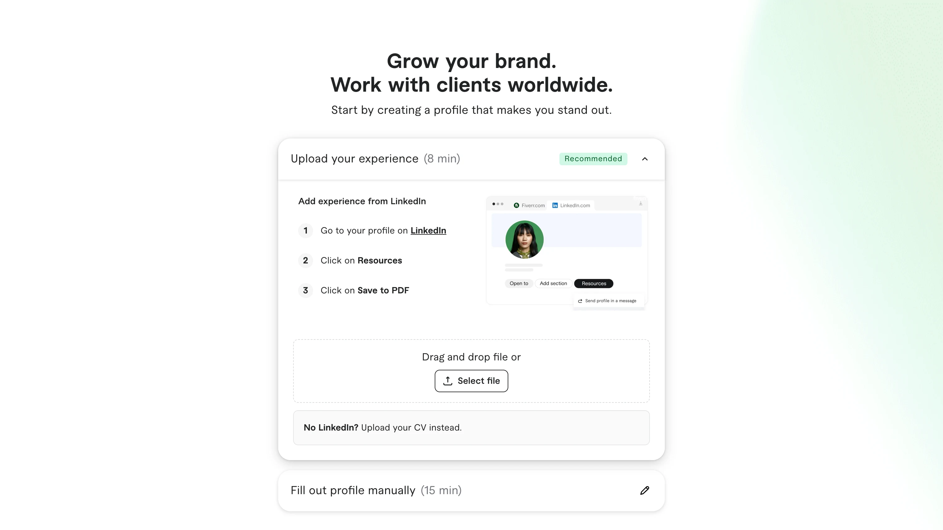
I went through the first entry at Upwork, Fiverr and Insense screen by screen, from sign-up to the first screen inside the product.
Upwork asks for the role on the first screen, then keeps each question short: a step counter, a line on why it's asked and “Skip for now”. The goal question tailors what the person sees next.
Fiverr explains the username before asking for it and shows how long each path to a profile takes.
Insense is the closest to KIKI: a creator marketplace on a phone. Social sign-in sits next to email, every field says why it's needed, and before linking social accounts the app says it reads only public data.
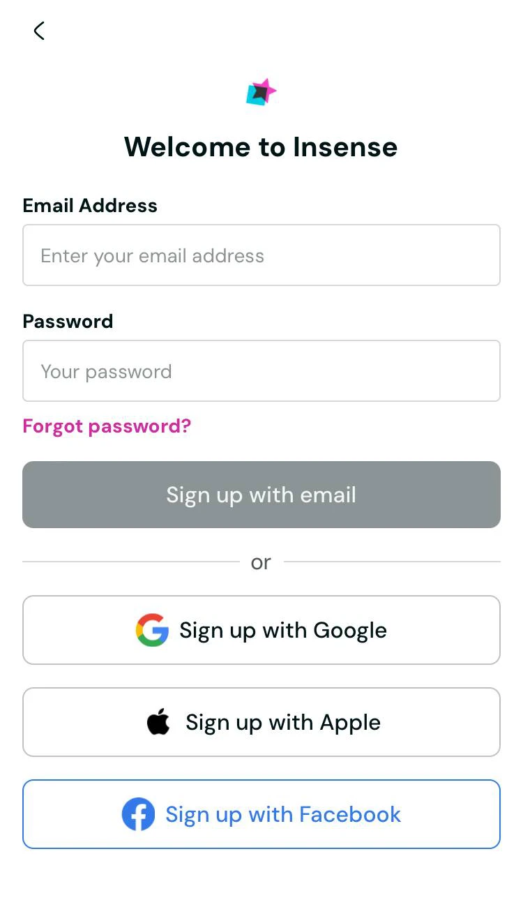
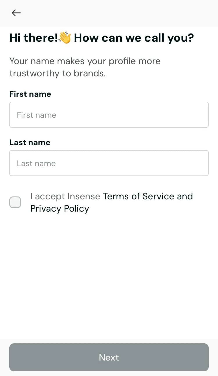
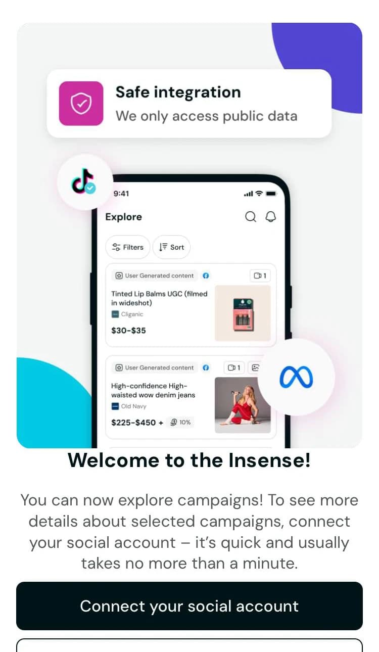
All three identify the person at sign-up and then let the product explain itself with a tour. I took three techniques: ask for data only when it's needed, say why it's asked, and end the entry with an action. The tour stayed out. Screenshots can't show whether it works, so it became a question for the prototype test.
Hypotheses
Summing up the research: onboarding didn't explain the product and didn't lead people to a first useful action. So the hypotheses had to remove friction at sign-up, explain the data we collect, bring the person to the first action and give a quick reward for it. Each one names the metric that should react.
- Sign-in with Google and Yandex ID fills in the email and name and skips the confirmation code.
- Every field explains why it's asked, starting with the nickname. The step stops looking like a formality.
- A short step-by-step onboarding explains the model before anyone asks the person anything.
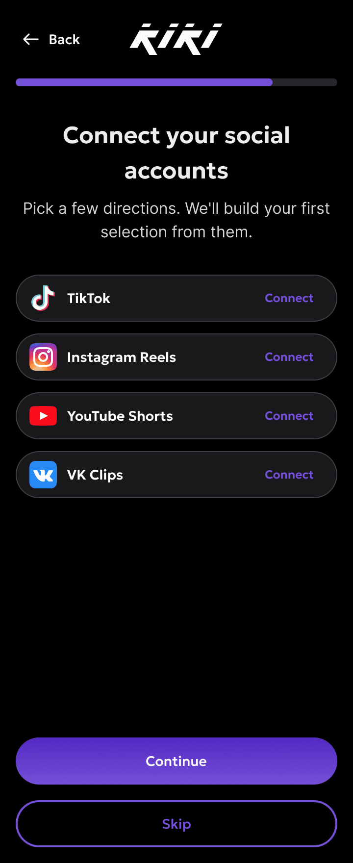
- Creators link their social accounts during onboarding and see how their actions lead to a result.
The trade-off I took on purpose: the path to the first action gets longer. Friction goes away at the entrance, and after the account there are more steps than before. The bet was that people quit because at the end of the short path they didn't know what to do.
Role as intent
Asking for the role at the entrance is a blind choice, and roles change. Dropping the split would ignore the funnel, where brands and creators broke in different places.
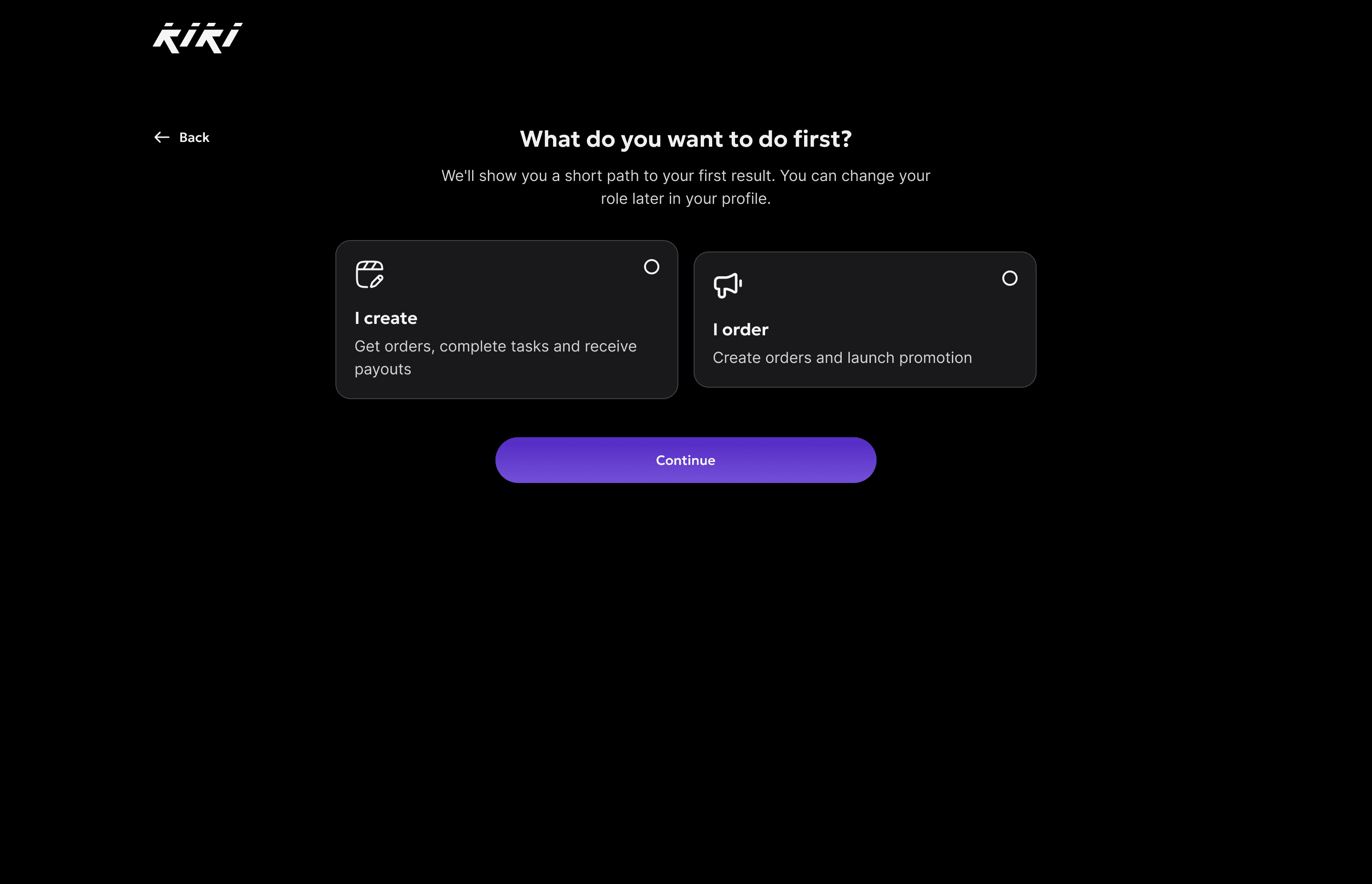
The answer was a third option. The role is asked as an intent: "What do you want to do first?" in place of "Who are you?". The answer is reversible, the step can be skipped, and a screen that explains the model comes before it.
Wireframes and prototype
I worked out the scenarios and flows in Claude Code as interactive wireframes, so the logic could be checked while it was still cheap to change.
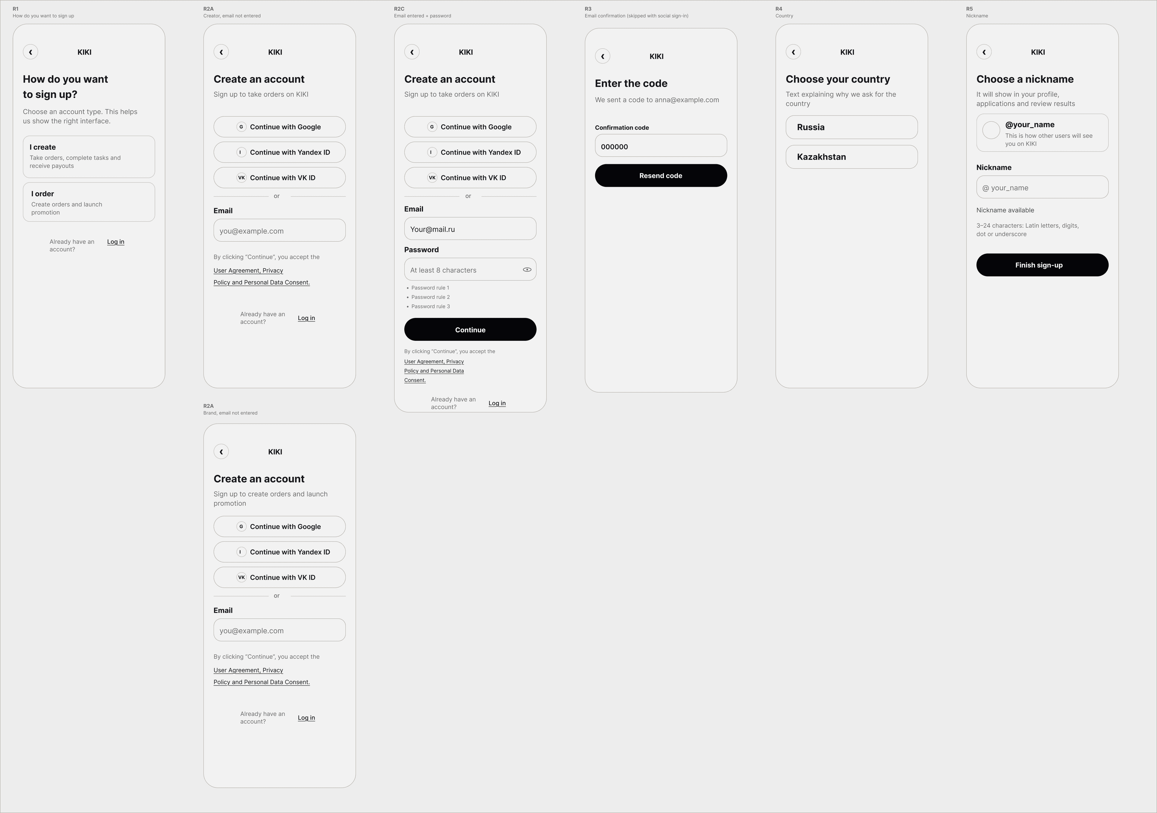
Then I loaded the project's design system, Hero UI, into Claude Design, adapted it to KIKI and built the pages there at 1440 and 360. A large share of creators arrive from a phone, so mobile is the main scenario.
In a day I built a full prototype of the new flow as a real front end. Live users went through it and the hypotheses held. The first version came out too long, so we cut it down to the length at which a person still gets the main features.
Every screen went to development with a short spec:
- Continue
- Info cards
- Sticky on mobile
- Disabled until chosen
Sign-up
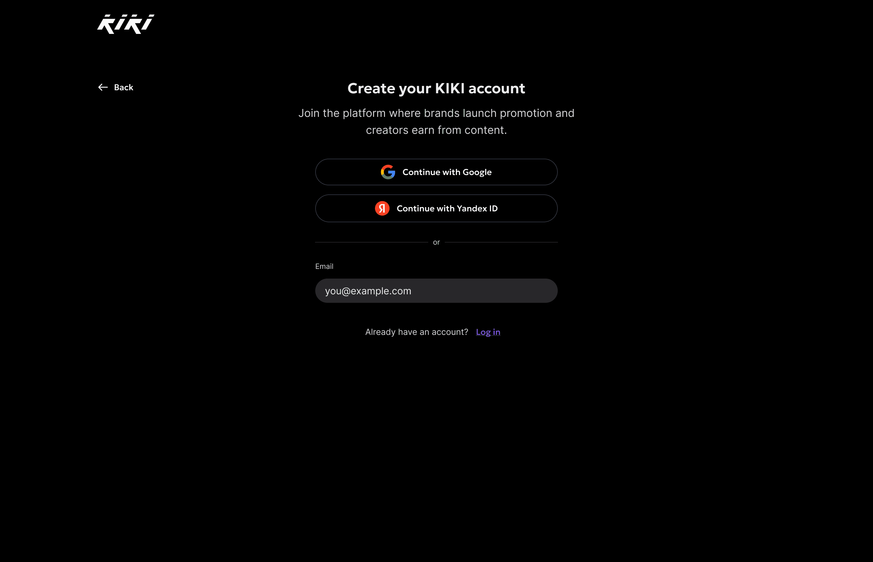
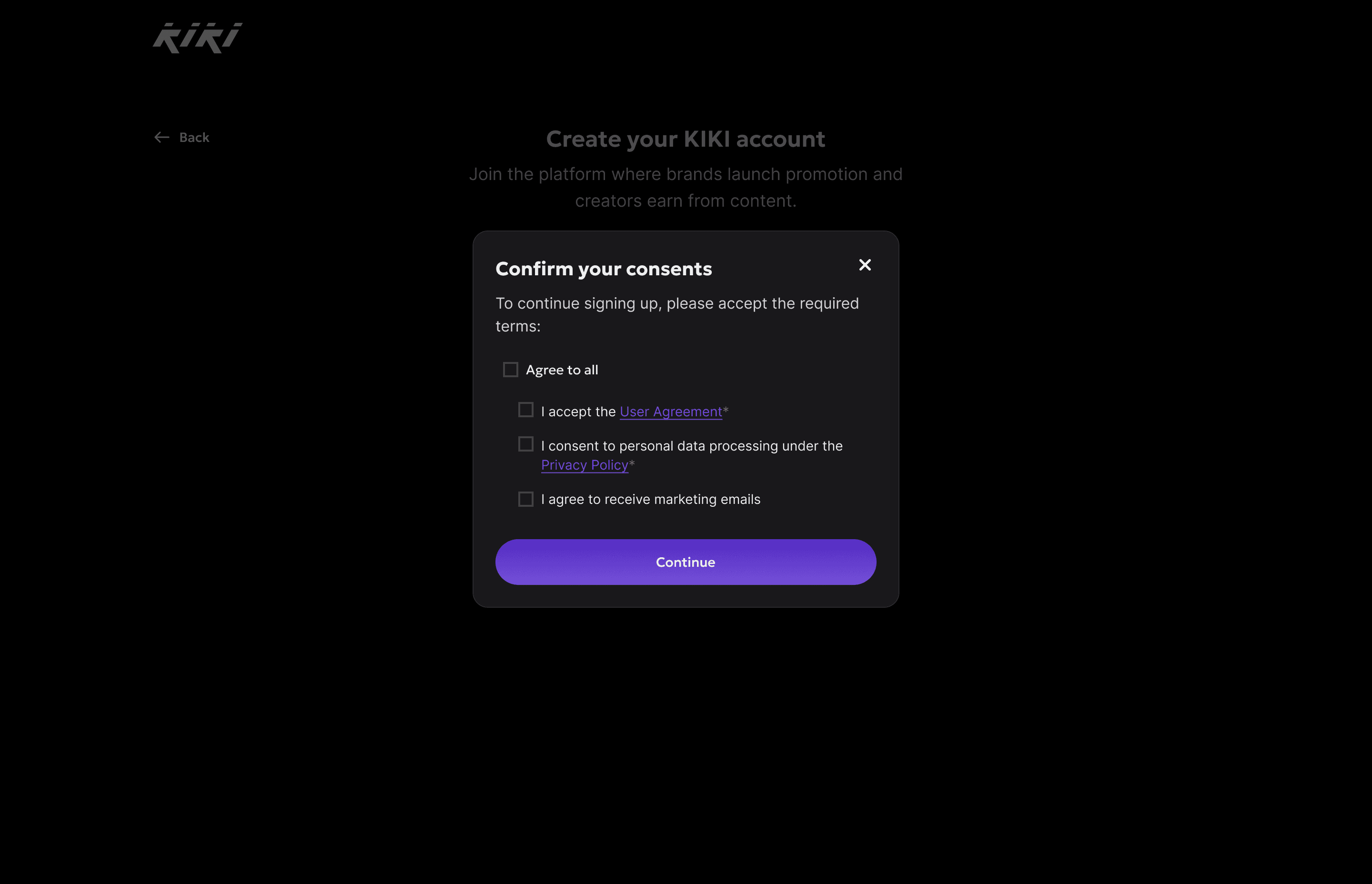
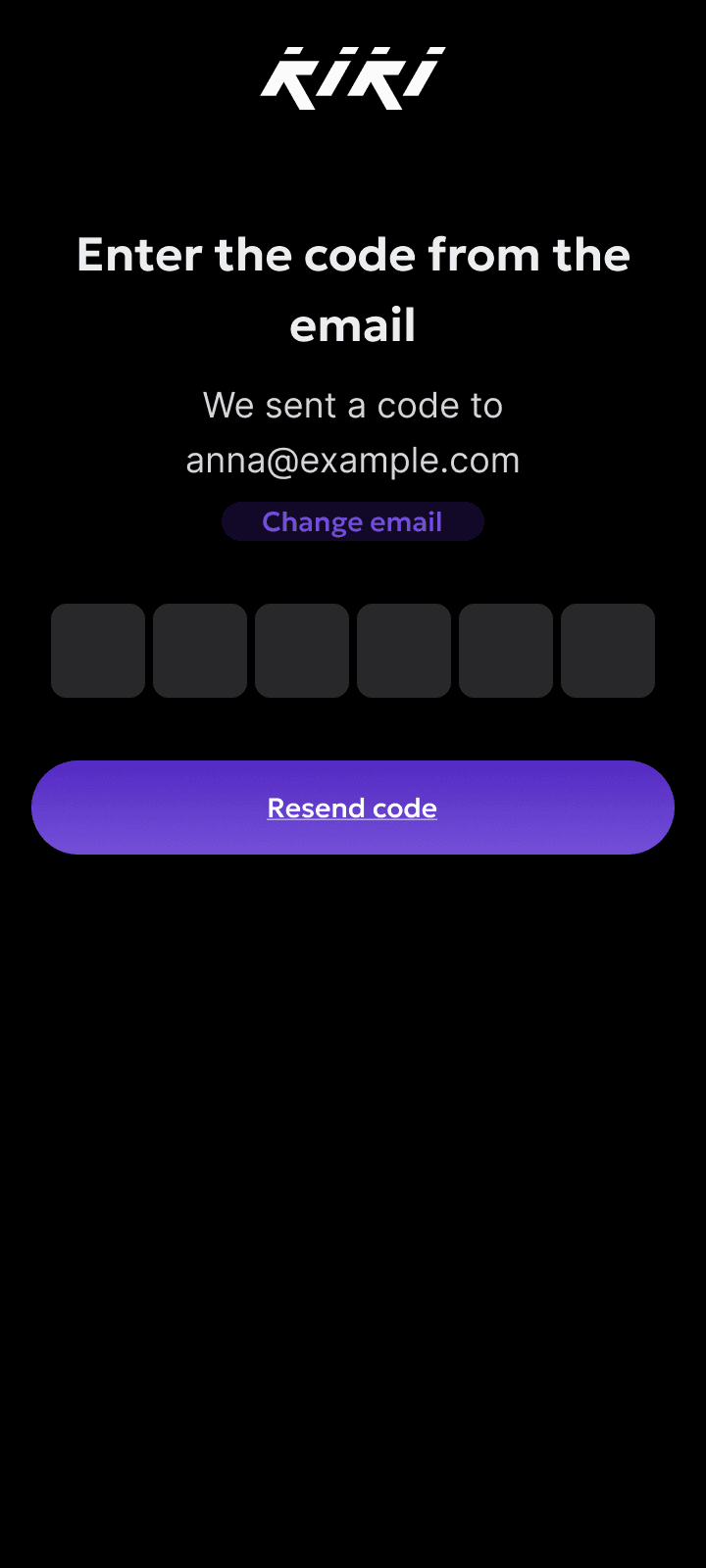
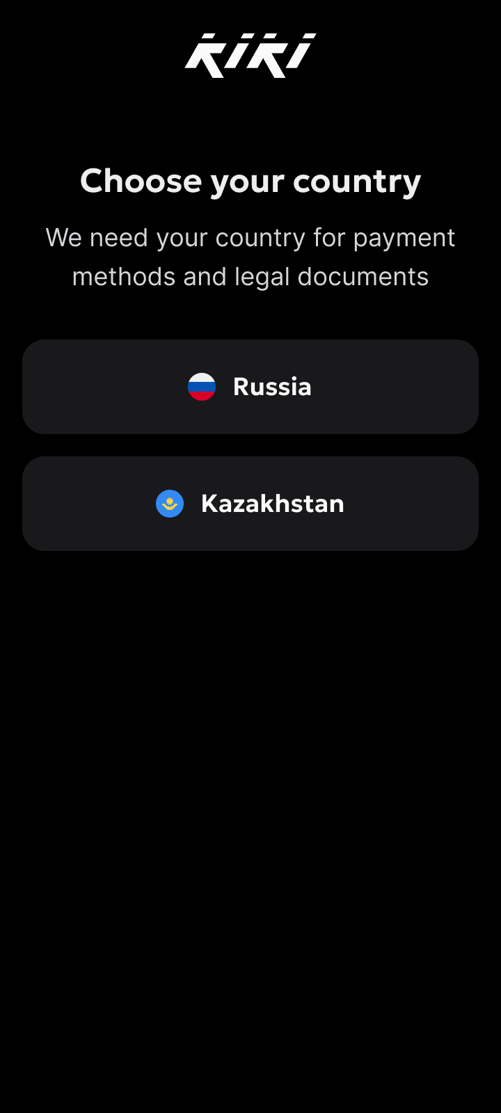
The main path is Google and Yandex ID, which skip the confirmation code, the exact step where the old flow broke. Email stayed as a fallback.
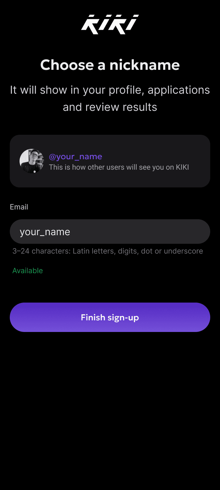
Onboarding start
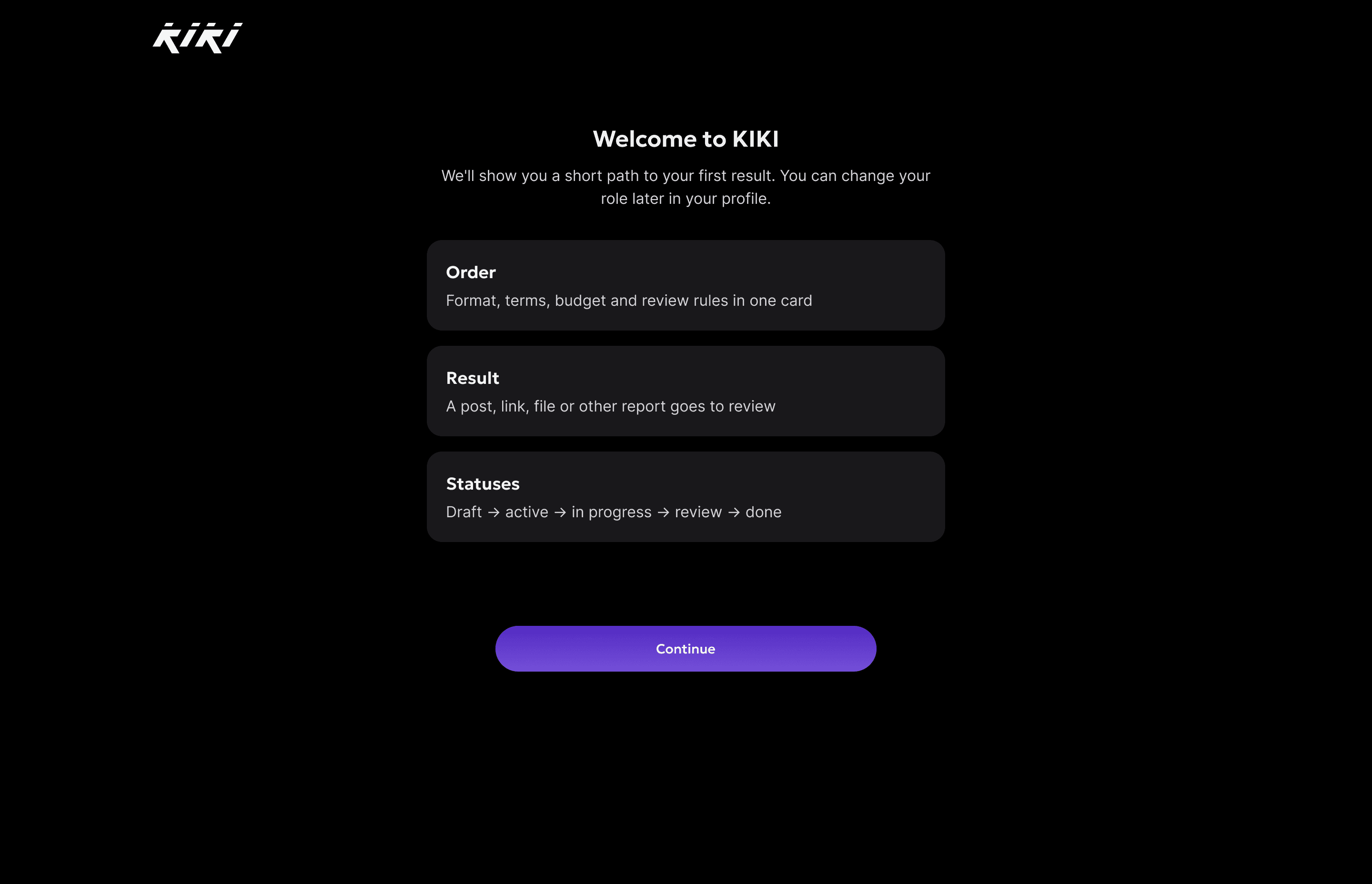
"Welcome to KIKI" explains the model with three cards: order, result, statuses. Then comes the fork: "I create" or "I order", with a note that the role can be changed later.
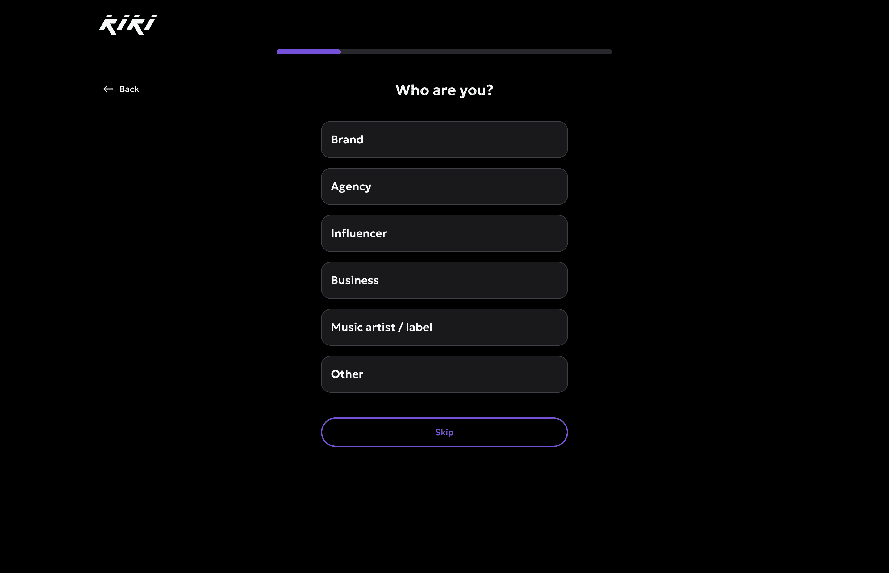
Brand branch
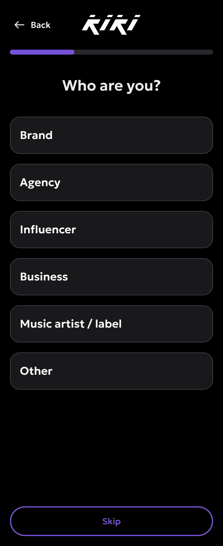
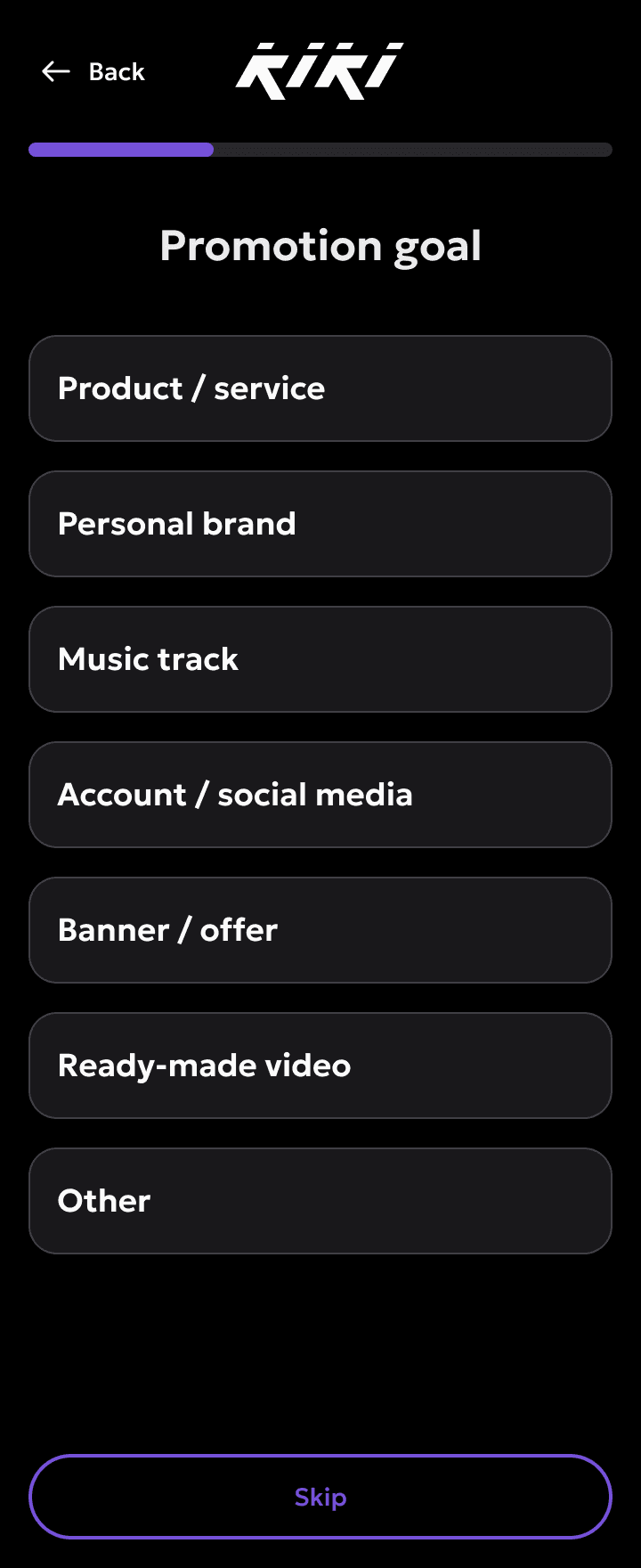
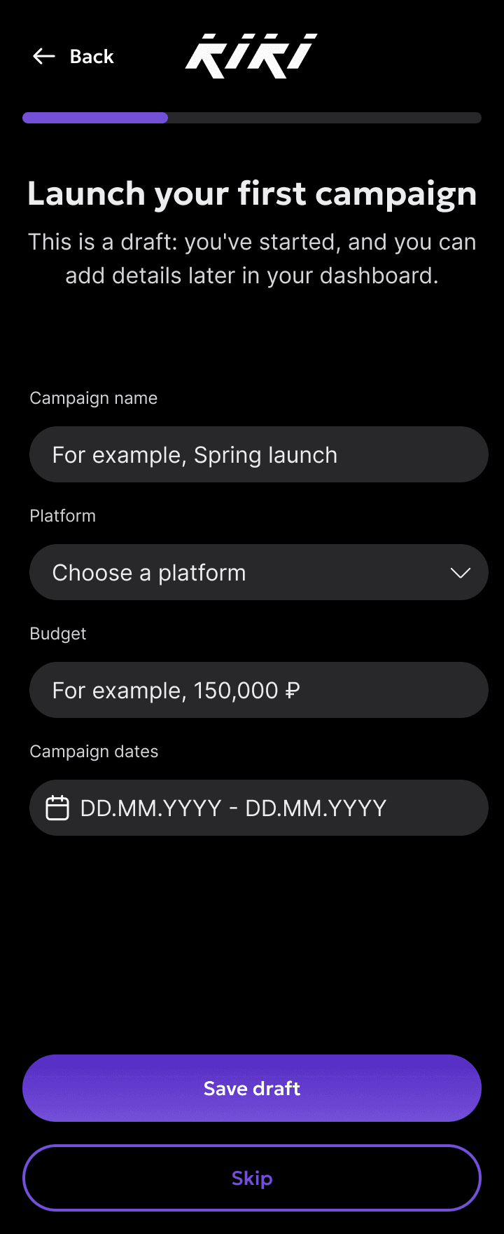
A brand goes from the type of company through the goal and the campaign format to launch.
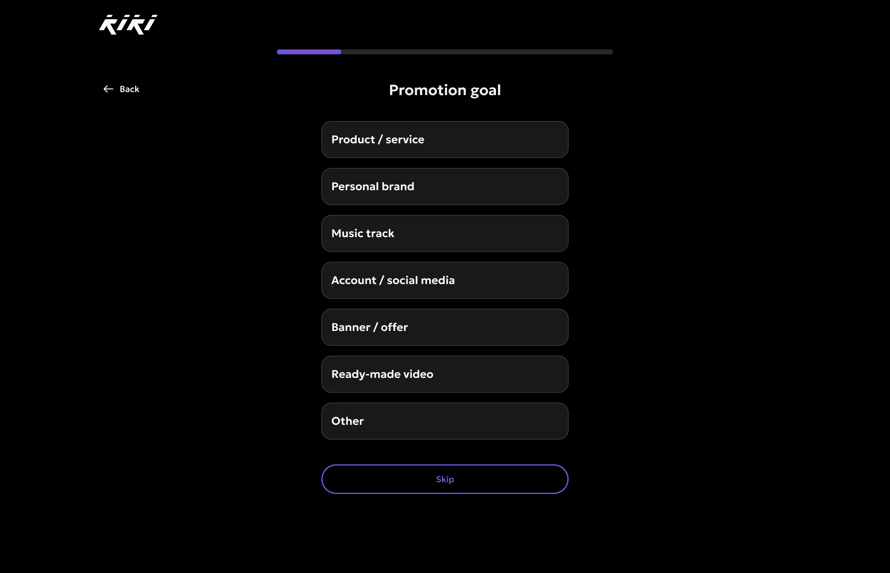
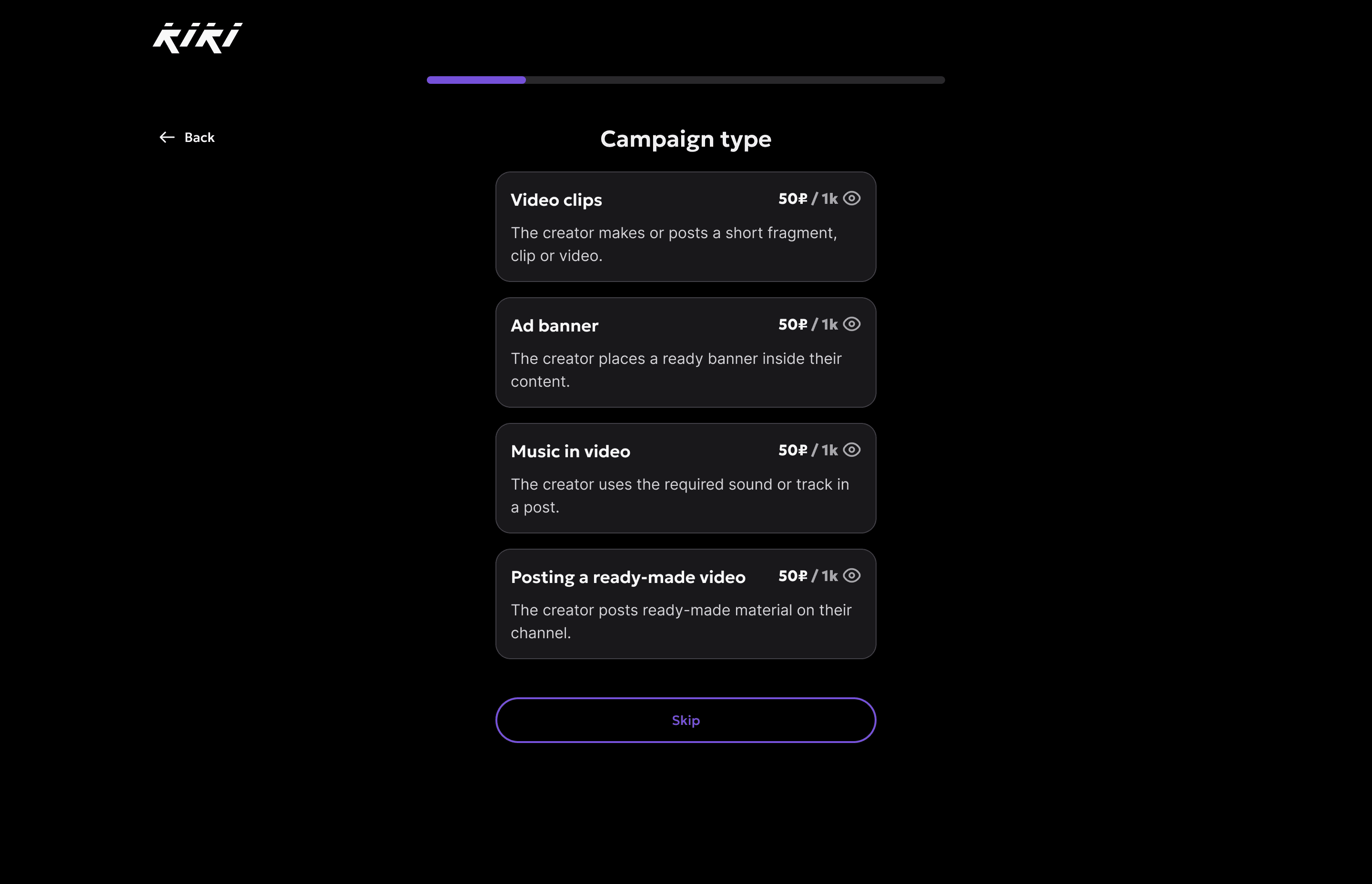
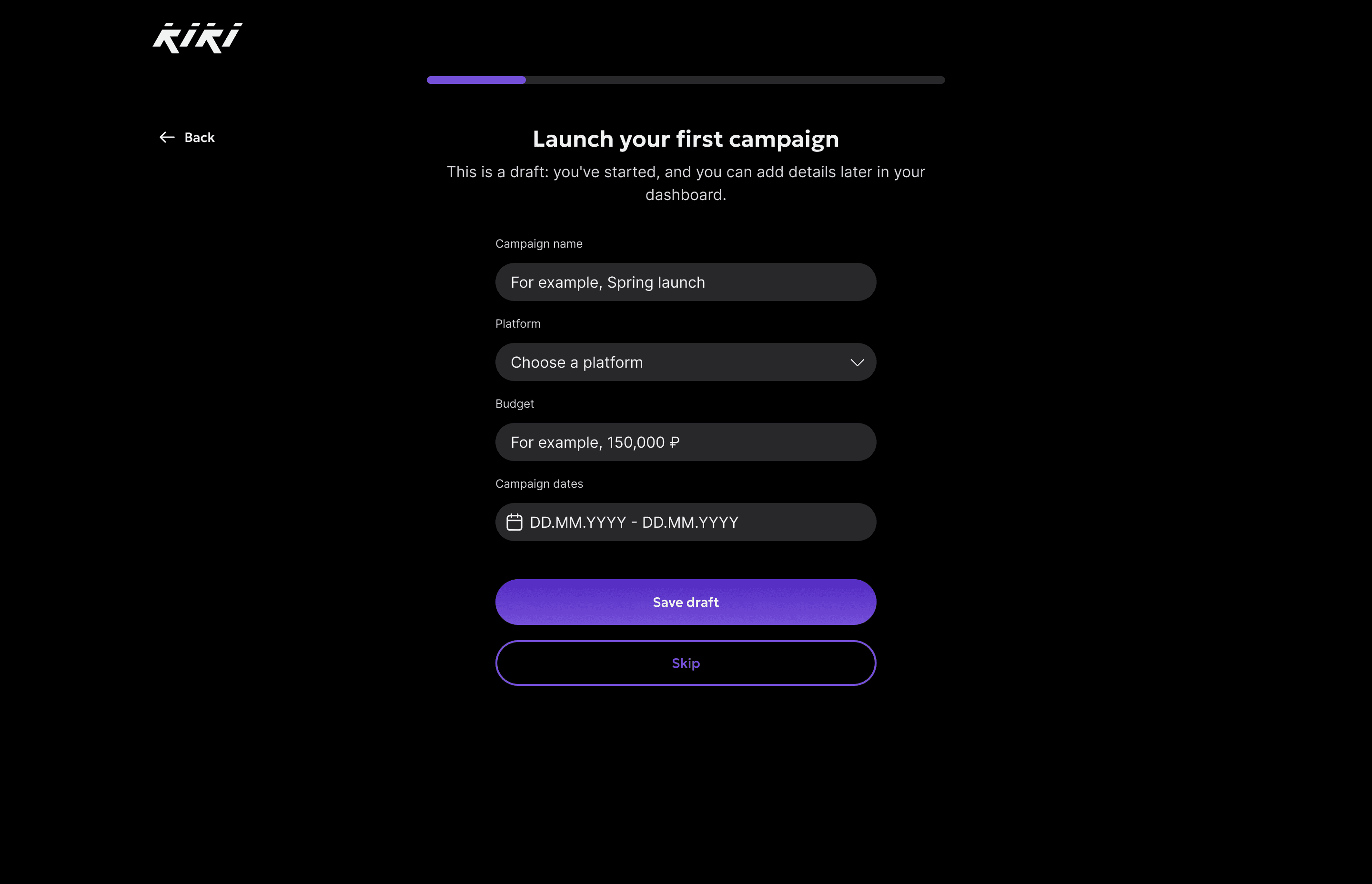
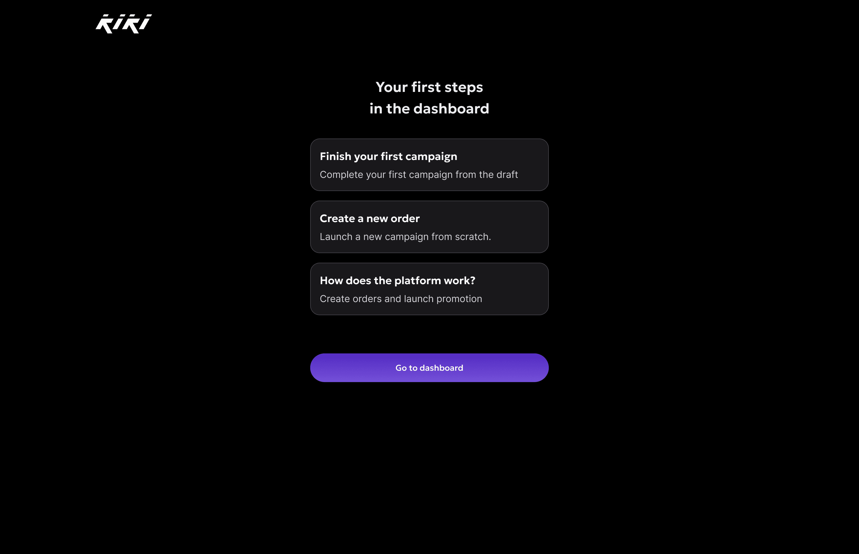
After launch the dashboard offers three first steps: finish the draft, create a new order, or see how the platform works.
Creator branch
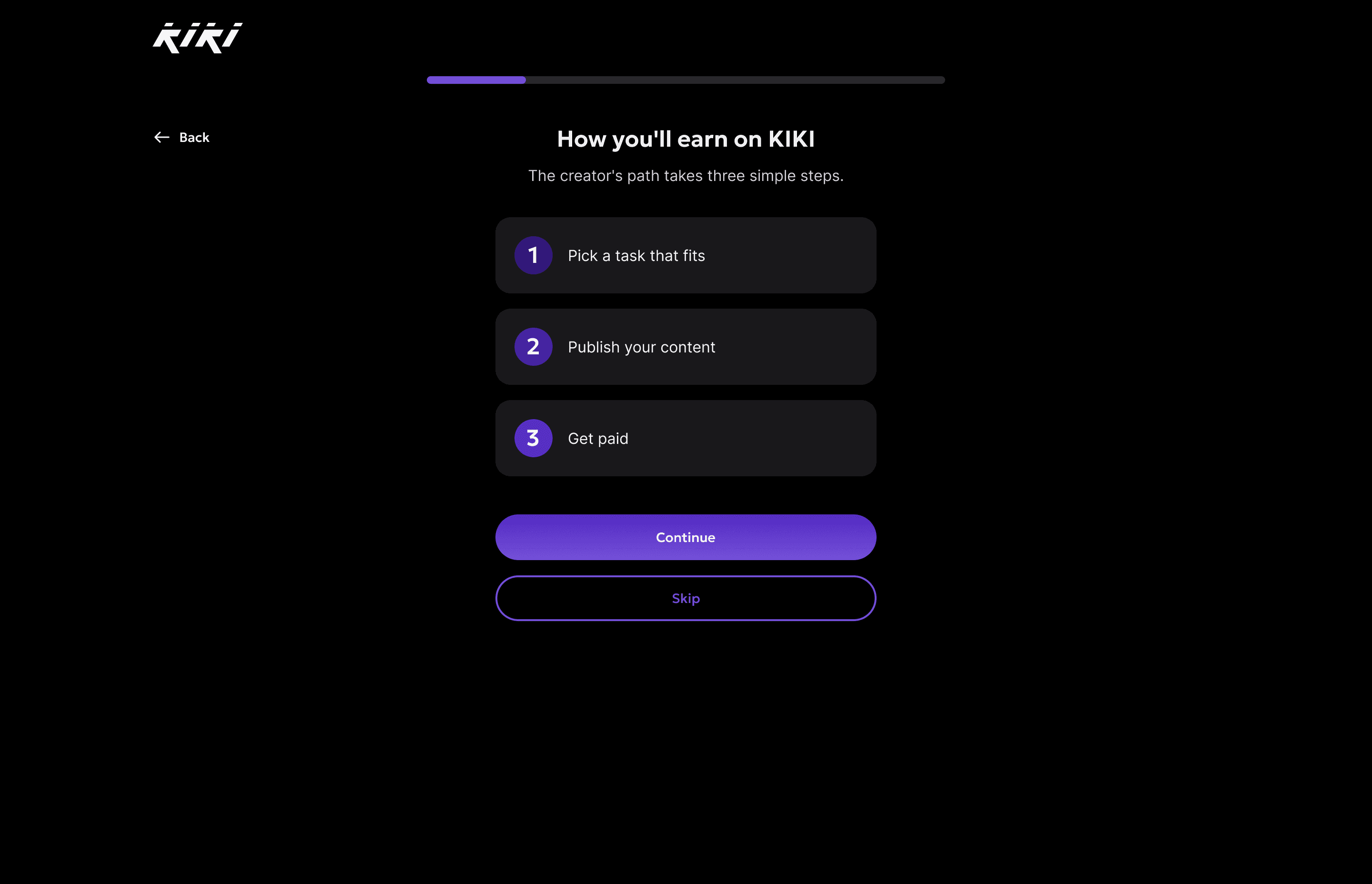
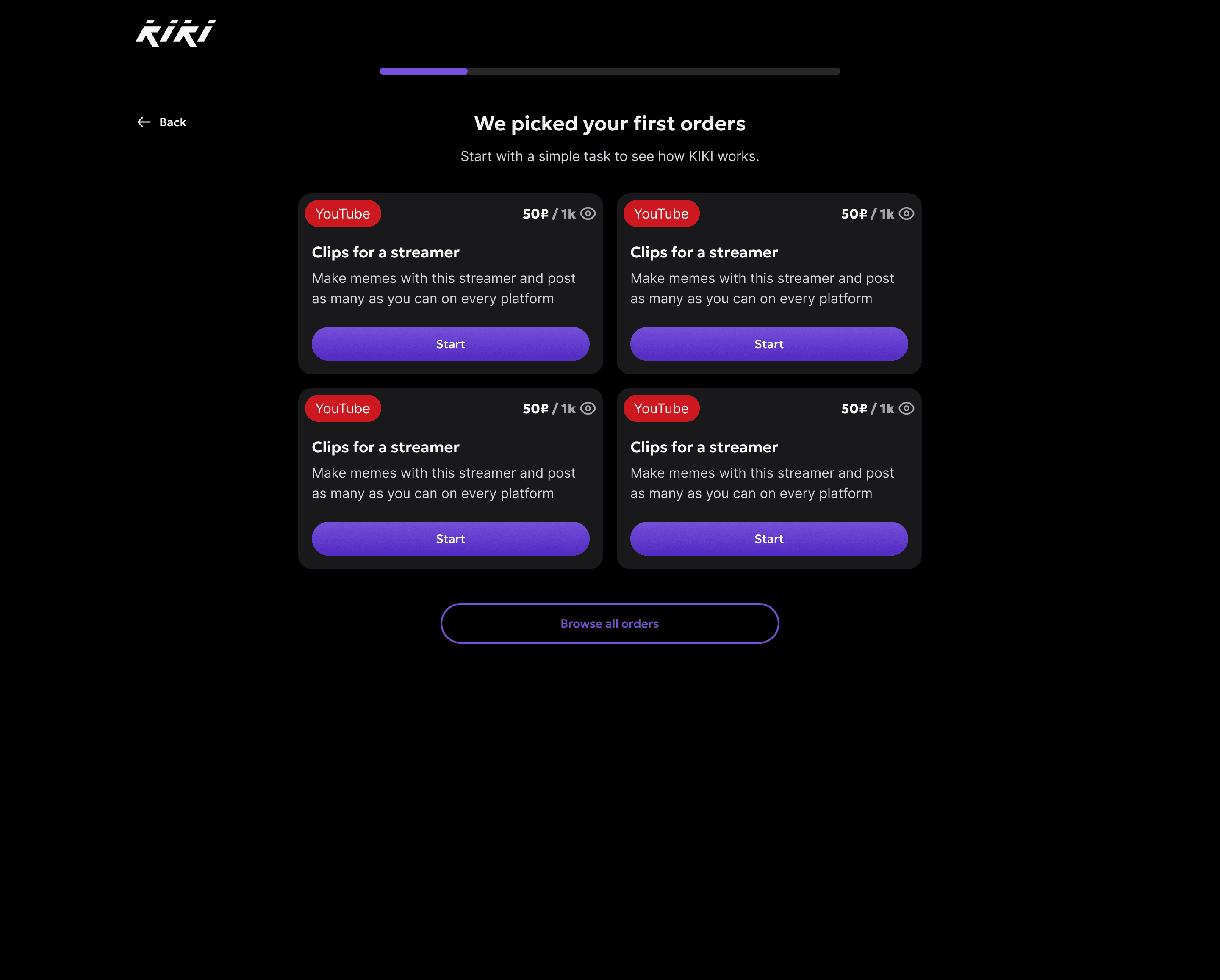
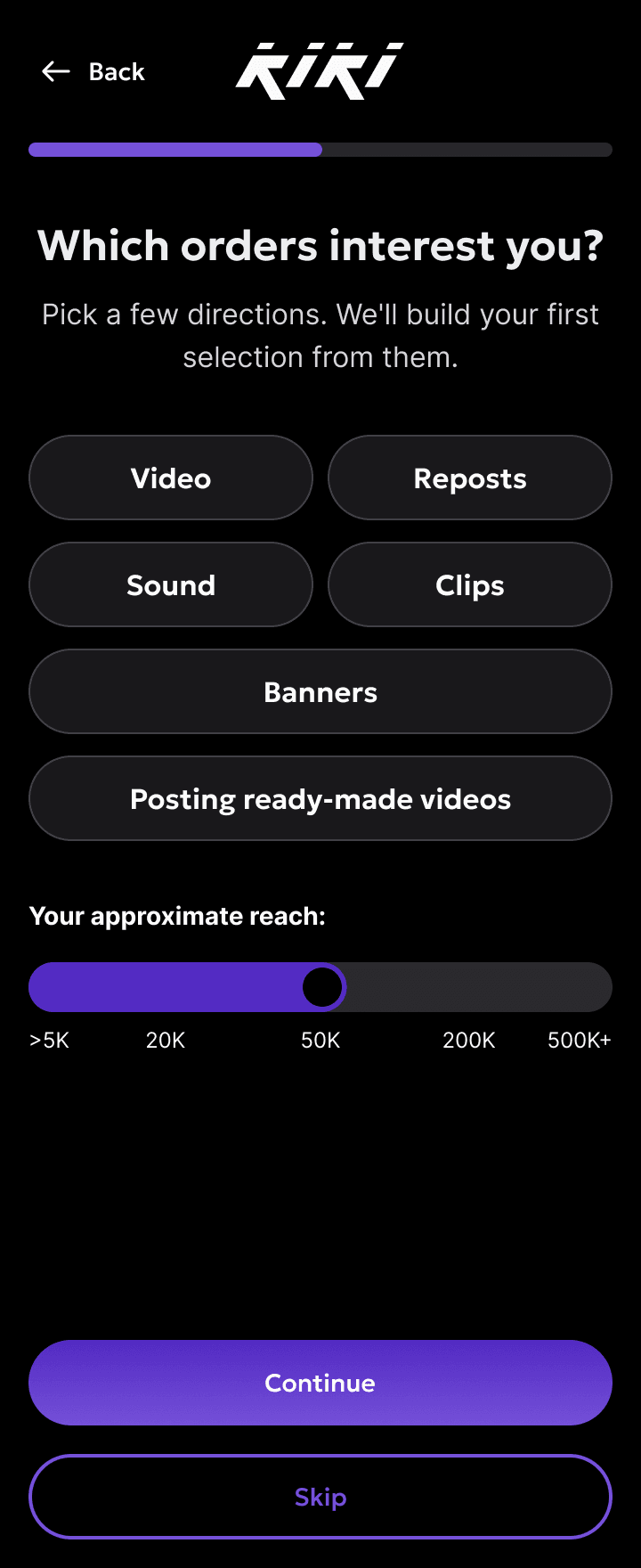
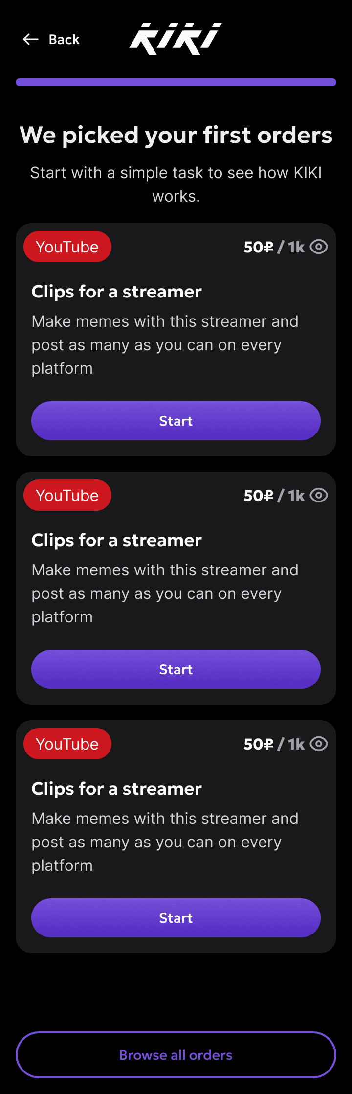
A creator learns how earning works, picks formats and links social accounts. The branch ends with real orders that match what they said about themselves.
Results
The same front end went into development. The team's developer reviewed the code, and after the review it went to the backend. After the release we compared the same funnel, with the same role splits, against the baseline period.
- +20–25%
- Sign-up completion
- +15–20%
- Activation, the share reaching the first key action
Sign-up completion: +20–25%. One blocker, one fix: a visible button and social sign-in that skips the broken code step.
Activation: +15–20%. Several changes shipped in one release, so we don't know how much each contributed.