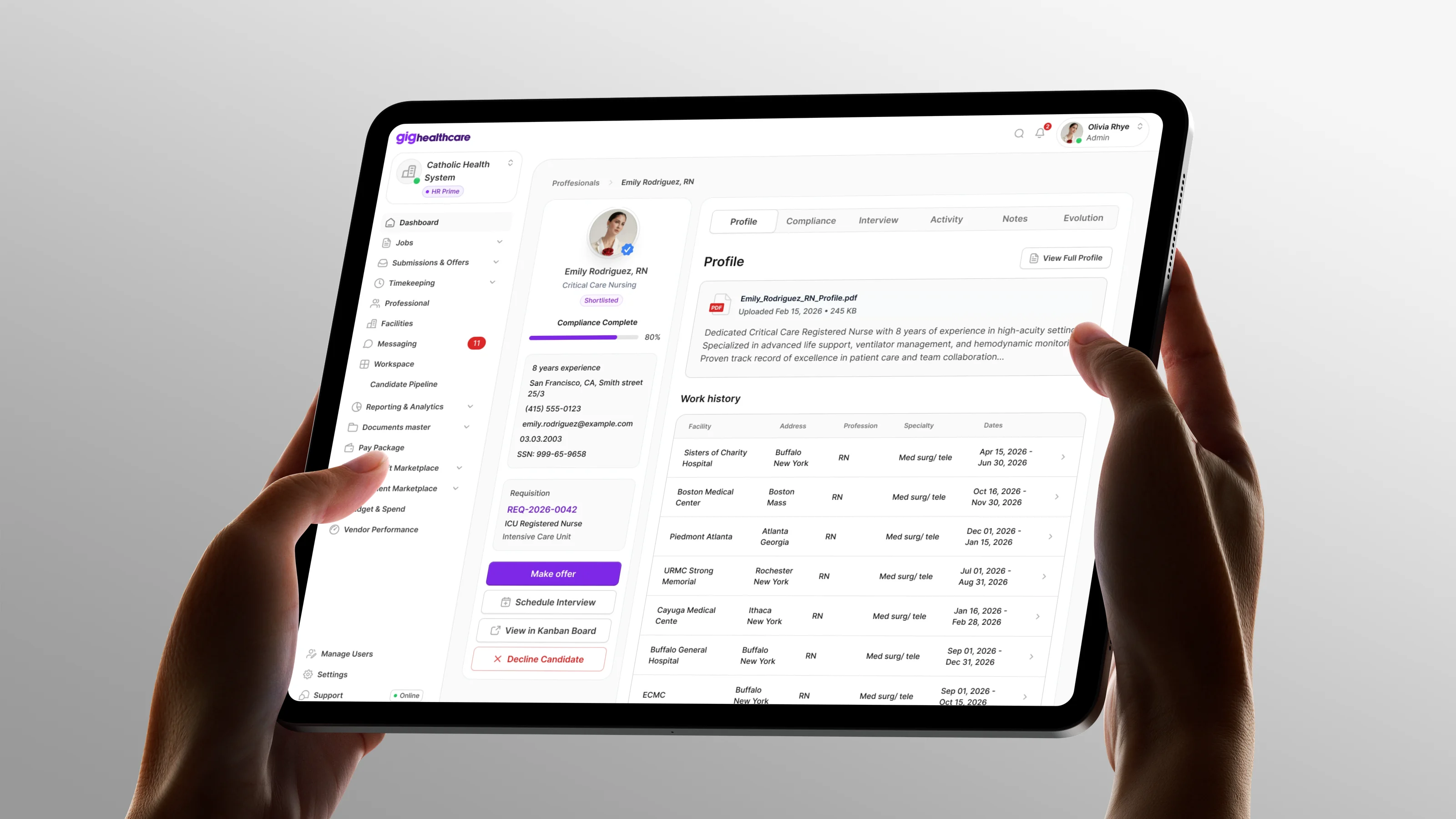
Classology
A mobile AI study app where a solved task turns into notes, flashcards and a quiz
- 2026
- Product Designer
- Classology
- Product designer, project manager, developers
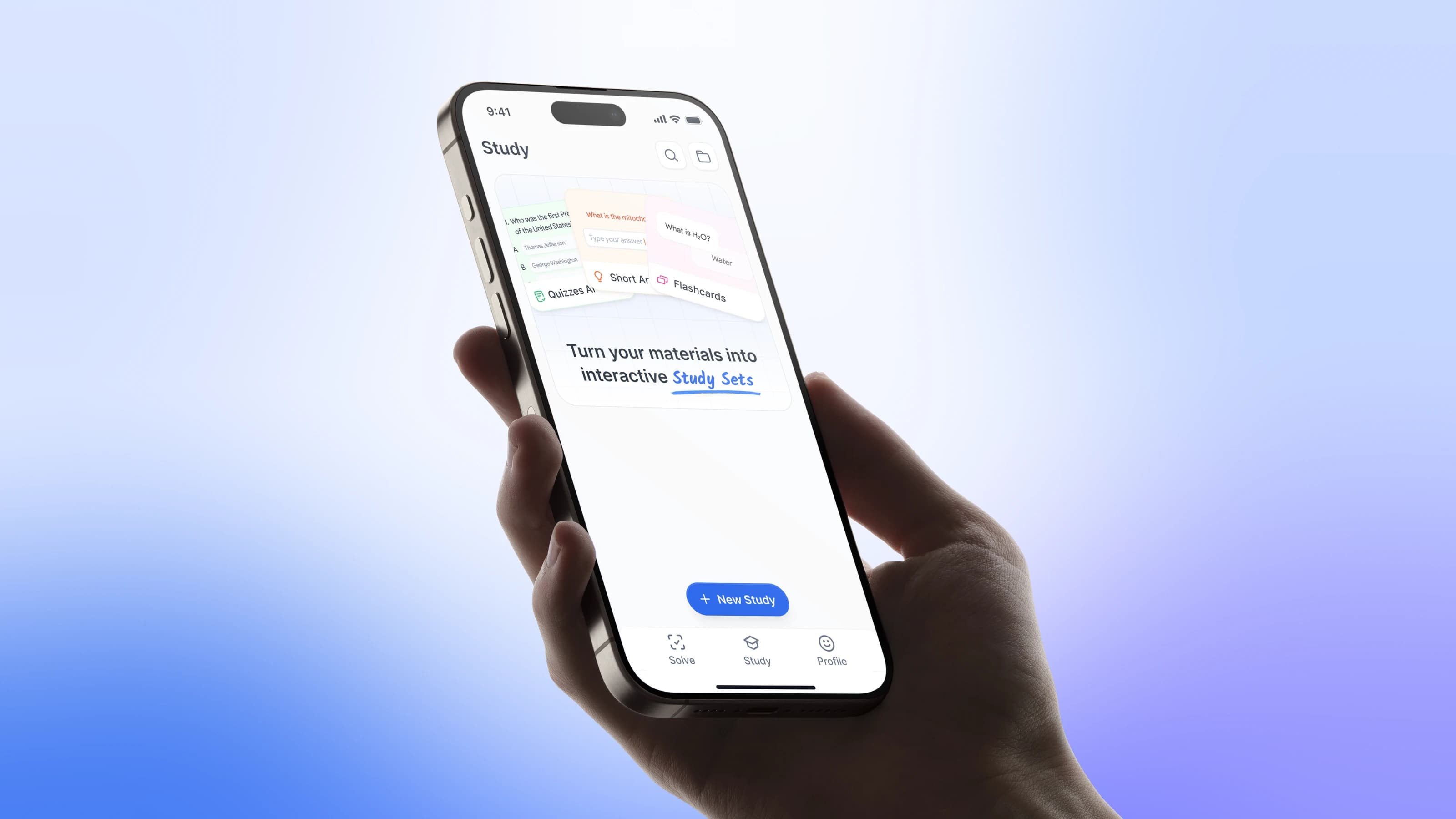
The task. Classology is a mobile AI app for students. You upload a screenshot of a task, get the answer and a step-by-step explanation in a chat. The client already had a Chrome extension with over 100,000 users that solved tasks and wanted a mobile-first product. Most AI solvers stop at the answer, and students leave: they don't fully trust the result and have nothing to come back to.
What I did. A survey inside the extension, a teardown of competitors, hypotheses, wireframes in Claude Code, the UI kit on Untitled UI, onboarding, the solver chat, the Study Hub and two paywall funnels for an A/B test.
The result. A mobile study app designed from zero. The Spin funnel won the paywall test on live users and shipped. Superwall stayed in the product for every later paywall iteration. The exact figures are under client NDA.
- App releases are slow
- No video on the exit screen
Solve-to-study loop
The product had to stay instant for a student with homework due tonight, and still give a reason to open the app tomorrow. So the answer became the start of the session.
- Screenshot
- AI solve
- Answer and steps
- Study material
- Follow-up
- Seven formats
- Paywall
Research
We didn't start from a blank page: the extension already had live traffic. We used the extension as the research channel: before showing the final answer, it asked a short multiple-choice question. At that moment the person is waiting for the answer, so they reply instead of closing the window.
- Current behavior
- Pain points
- Learning intent
- Paid value
Answer options covered the usual routes (AI chat, Google, YouTube, friends) and the things students wanted after the answer: speed, an explanation, accuracy, notes, flashcards, a quiz, a podcast.
- Fast solving is only the entry point
- Trust depends on the explanation
- Study formats branch from the task
- Paid value feels like support
Competitors
I went through the direct competitors, Studley.ai, Gauthmath and Solvely.ai, screen by screen: onboarding, paywall and the app itself. Quizard.ai, Nerd AI and QuizAI were on the list for similar mechanics.
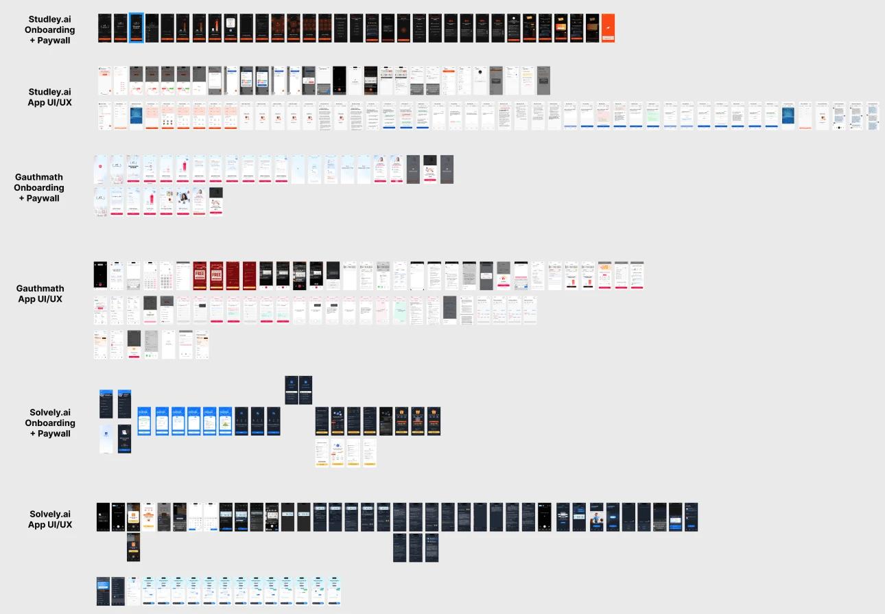
Everyone gets the student to the first answer fast, and screenshot input is standard. The difference is what happens next. Step-by-step explanations build trust, study formats keep people in the product longer than a bare solver, and a paywall that feels like a restriction pushes students back to free bots.
Hypotheses
Each hypothesis grew out of a question in the survey. The fifth one is the bet of the paywall test.
- If students mainly want the answer right after uploading a screenshot, the solve flow delivers it with no steps in between.
- If students want to understand the logic, the explanation sits inside the answer.
- If students want to keep learning after one solve, the app turns the task into notes, flashcards, a quiz or a podcast in one tap.
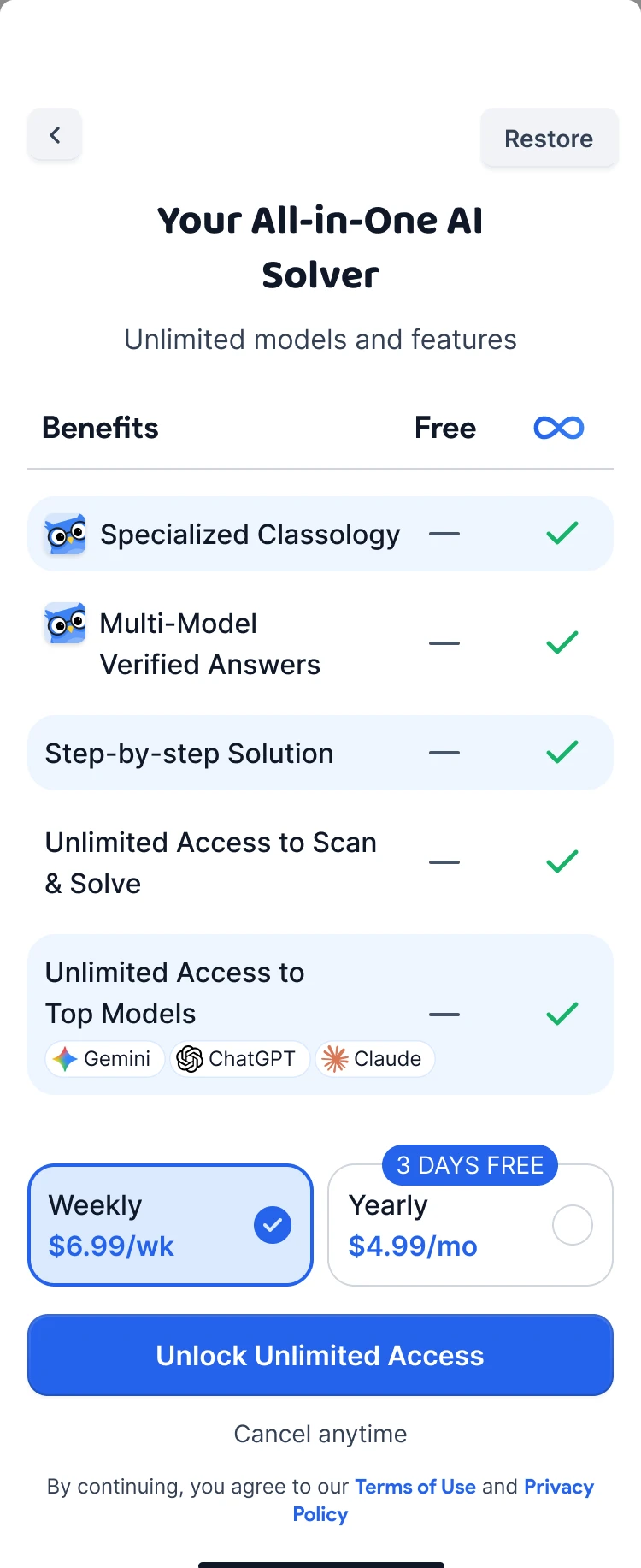
- If students judge a paid plan by its usefulness, the paywall sells concrete study capabilities instead of lifting a limit.
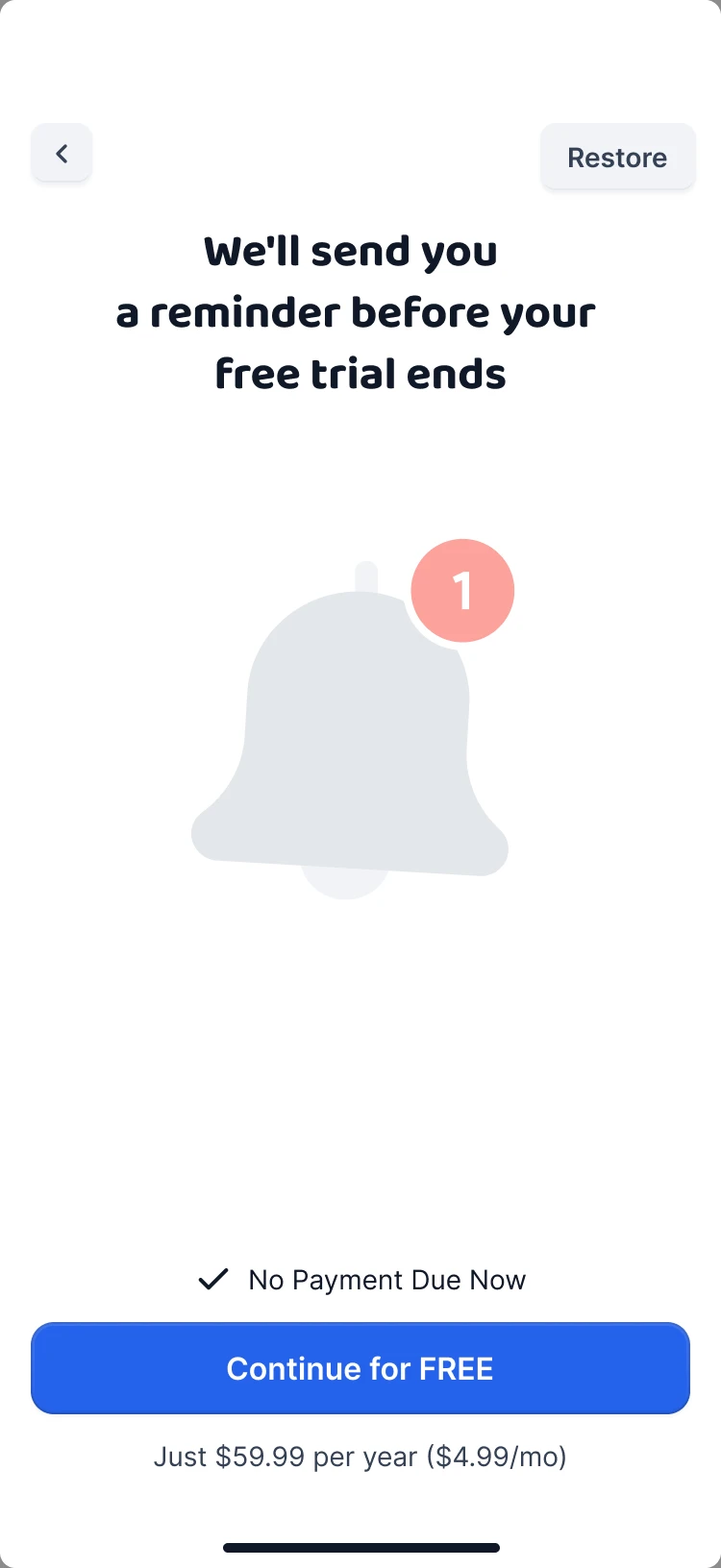
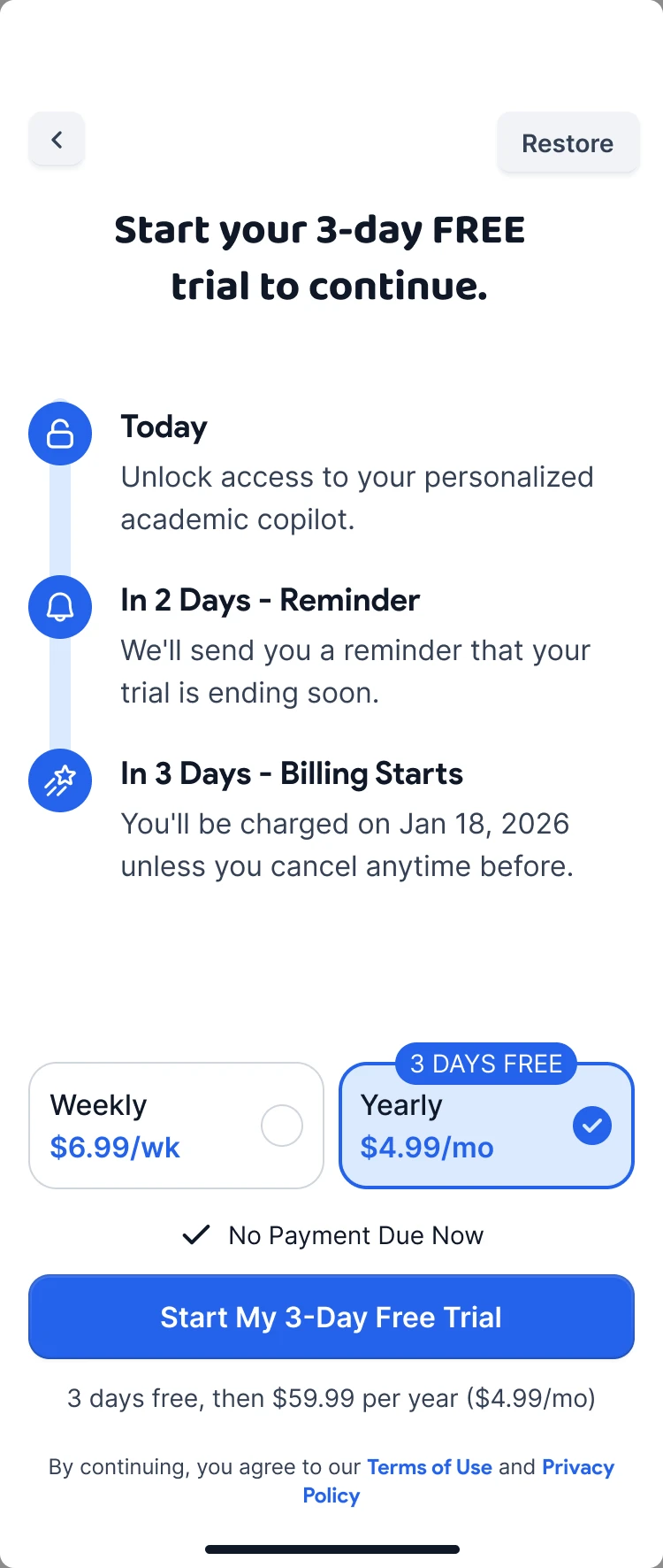
- If the main barrier is the fear of being charged without noticing, removing it before the offer makes a strong discount work.
Wireframes
I built the flows in Claude Code as clickable wireframes from the design documentation. The logic of the study formats was tested before any UI, while a change still cost minutes.
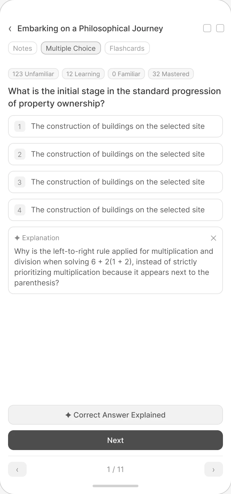
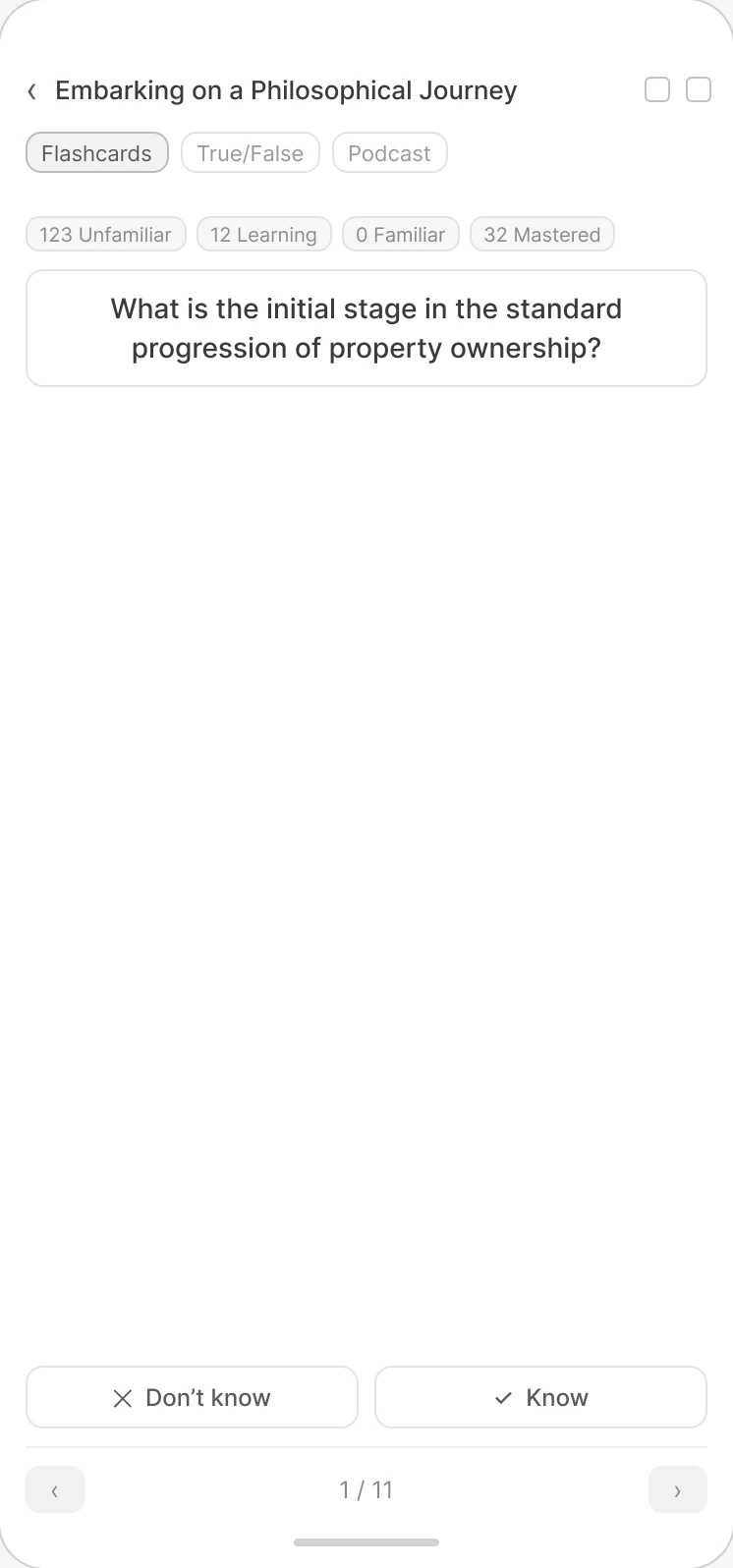
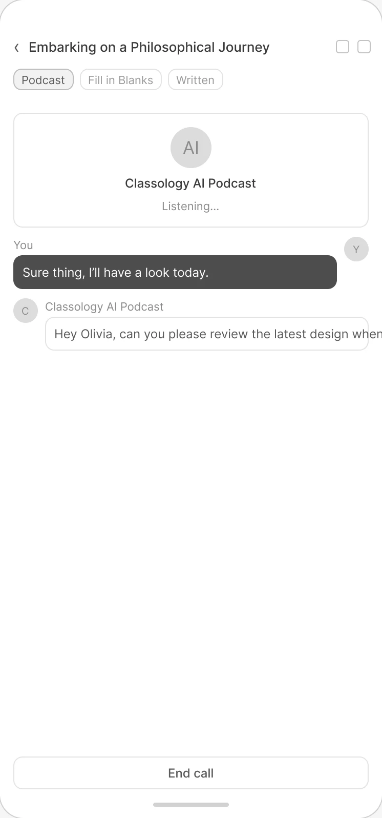
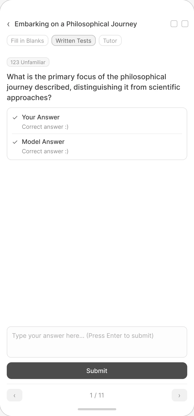
The UI kit is built on Untitled UI and adapted to mobile: study cards, the chat, urgency patterns and paywall states. The same base is ready for the future desktop app, so mobile and desktop don't split into two visual directions.
Onboarding
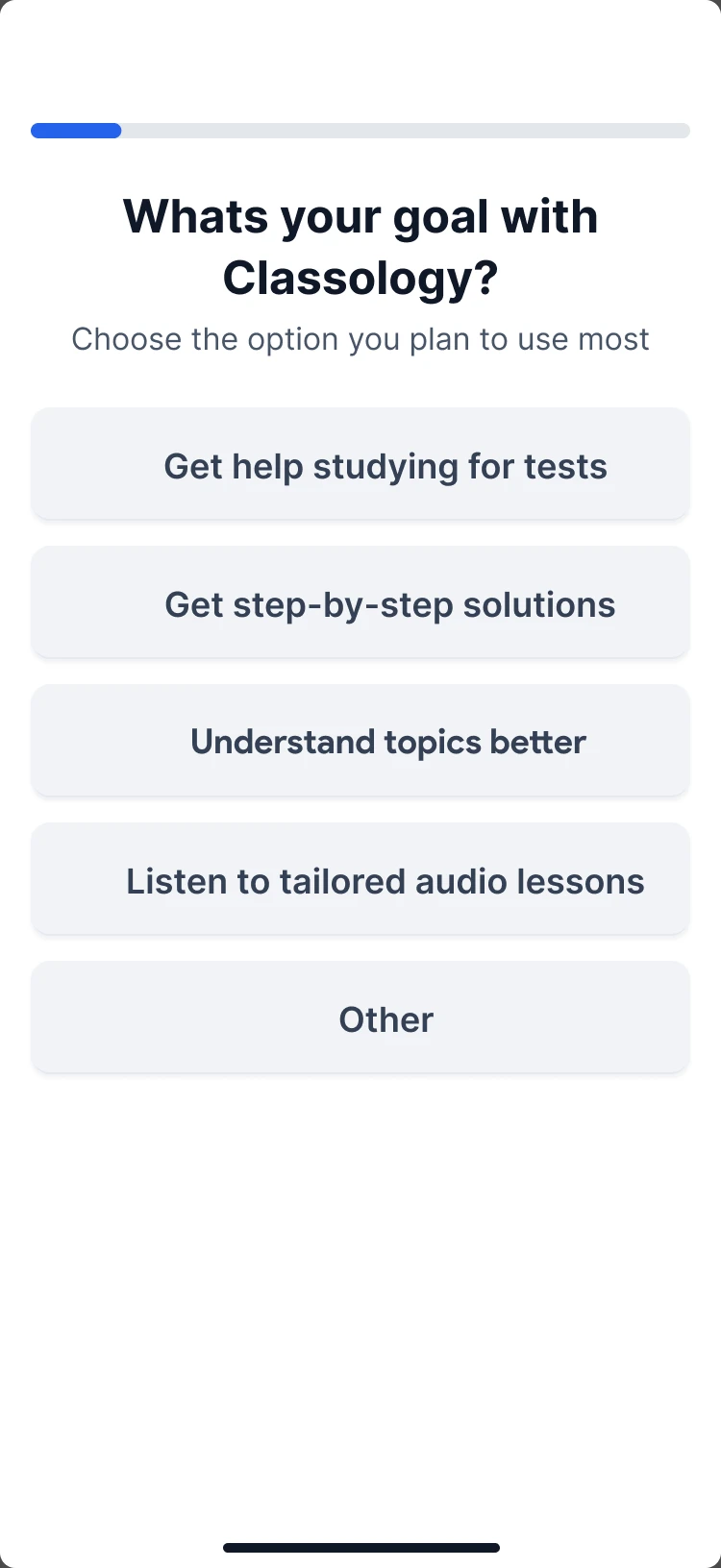
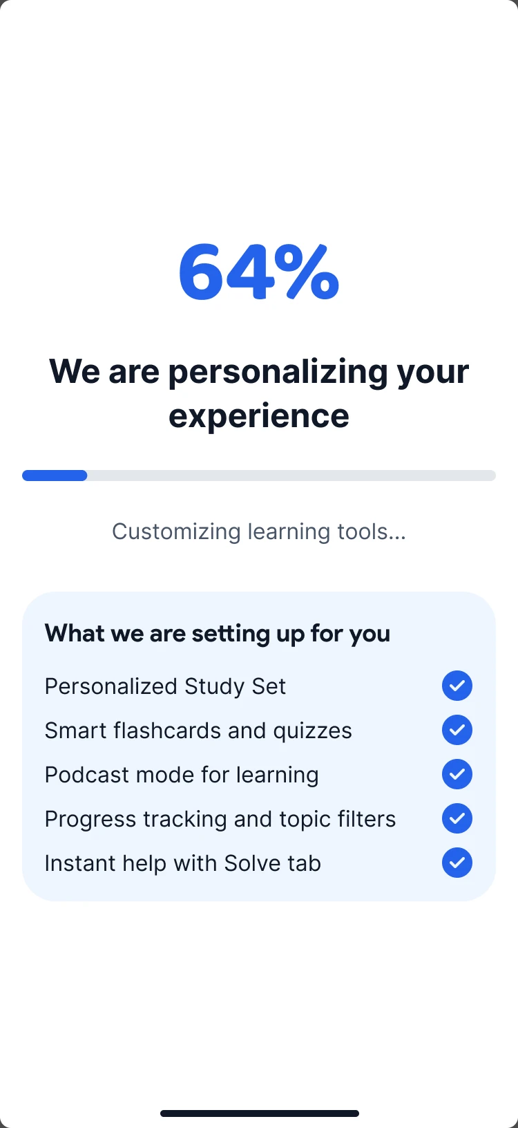
Onboarding sells a study system from the first screen: instant answers, better results than a general chatbot, study material from lectures and PDFs.
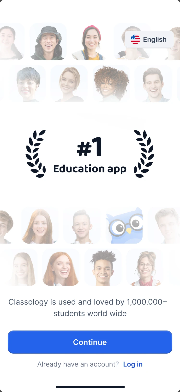
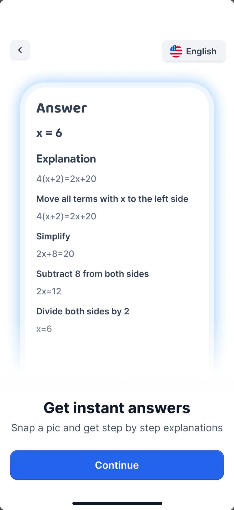
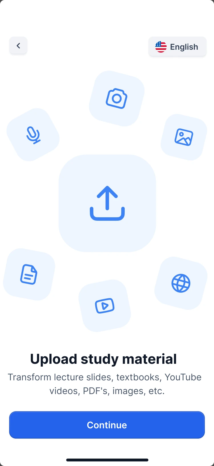
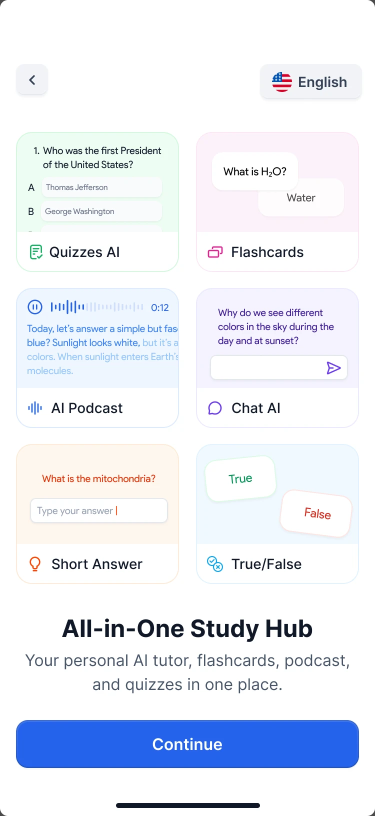
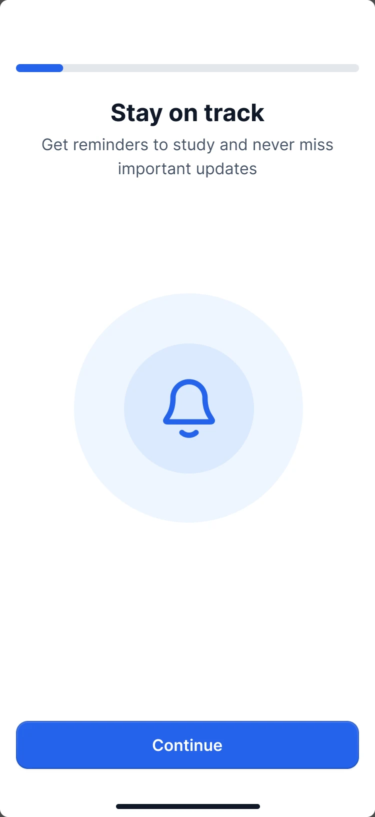
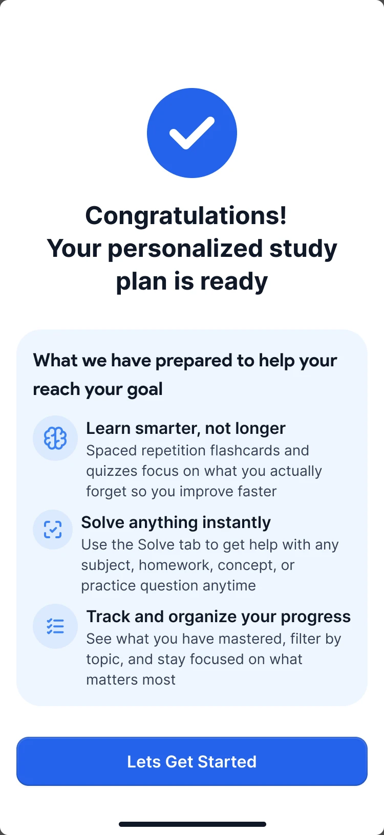
Then a few questions tune the study plan: how the student plans to use the app and what the goal is. The last screen shows what has been prepared for them.
Solver chat
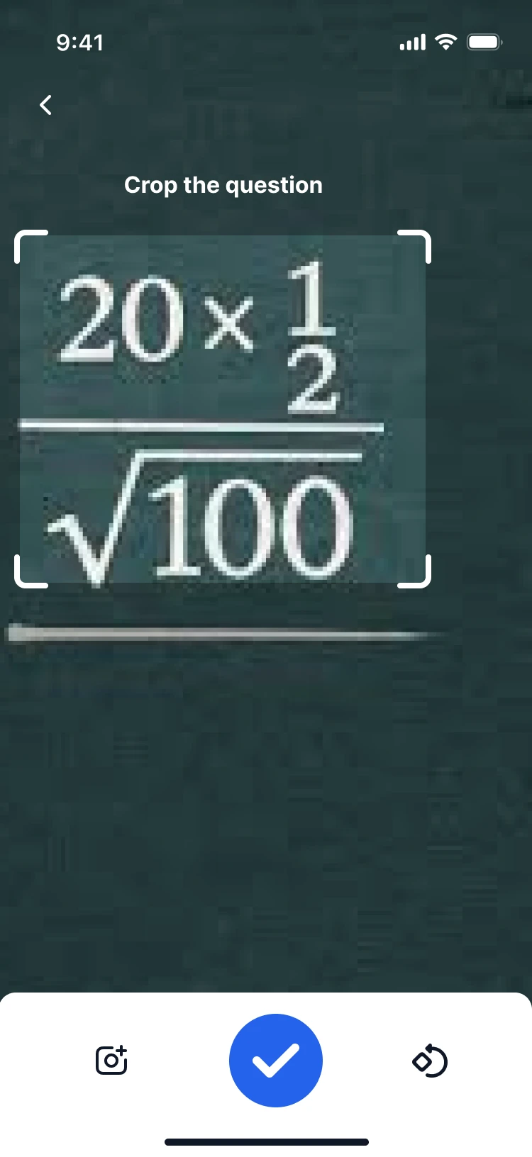
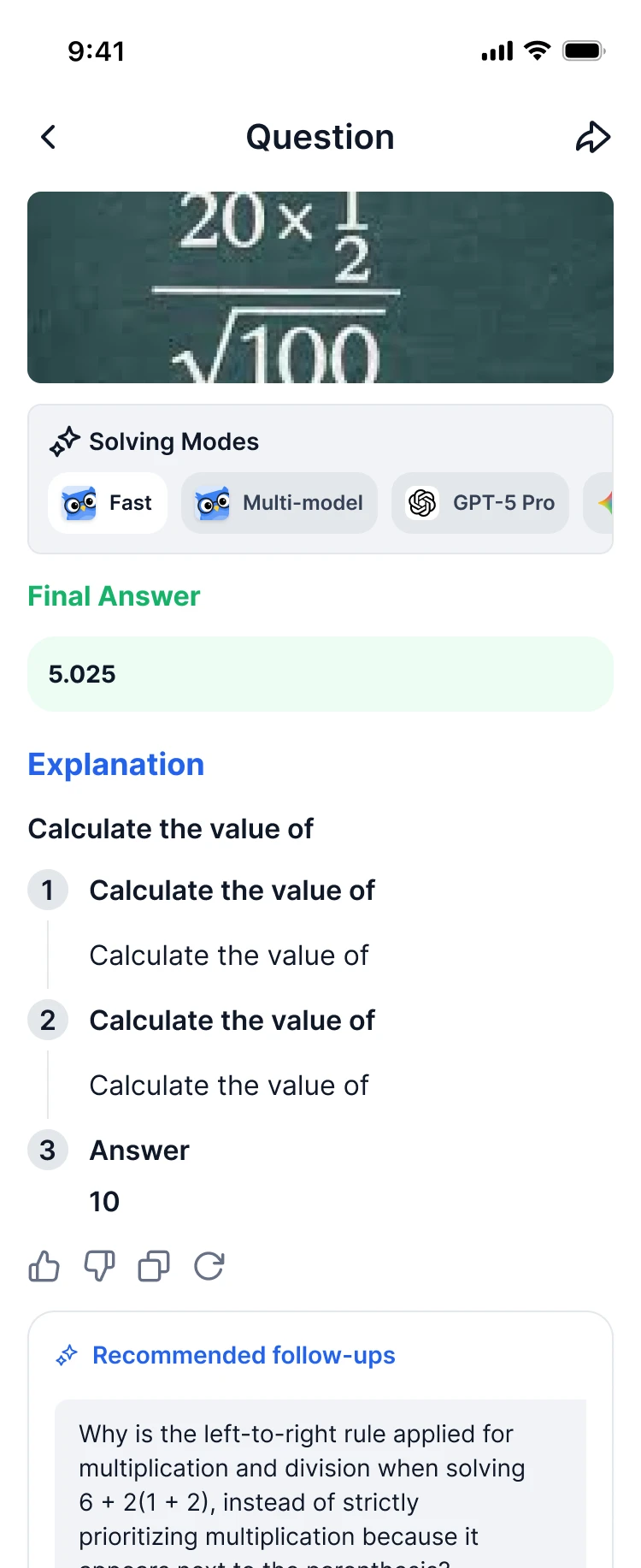
When I screenshot a problem from homework, I want the app to solve it immediately and explain each step, so that I can check both the result and the logic.
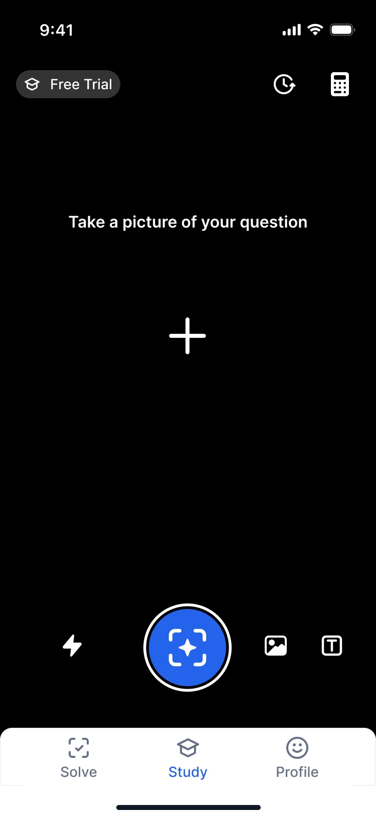
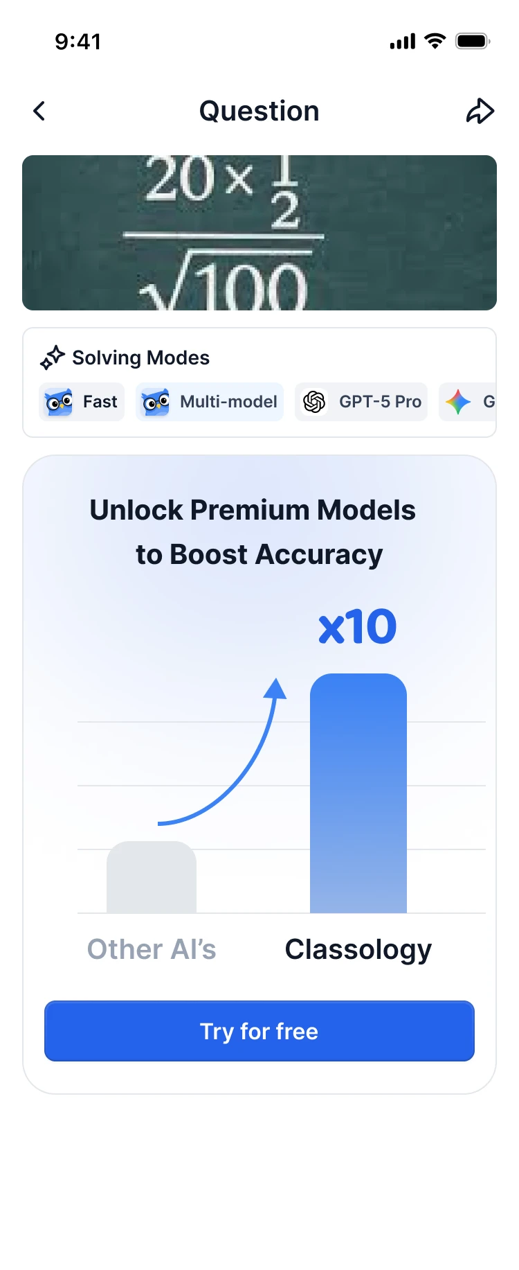
The screenshot goes straight into the chat. The student picks a solving mode, fast, multi-model or a top model, and gets the final answer with the explanation under it. "Explain further" and "Simplify" continue the conversation. Premium models are offered right in the answer, where the value is easy to see.
Study Hub
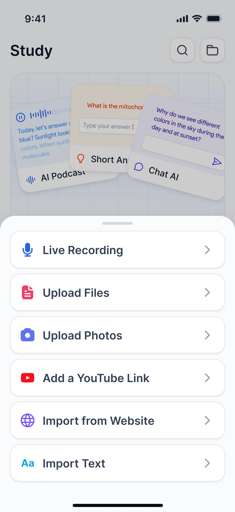
When I already solved one task, I want the app to turn it into study material, so that I can practice the same concept later.
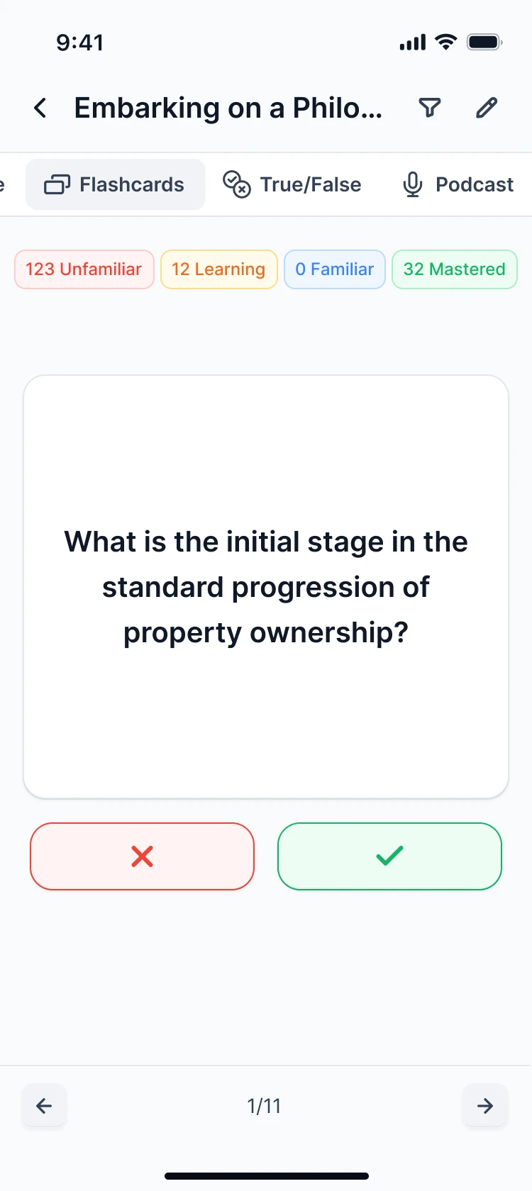
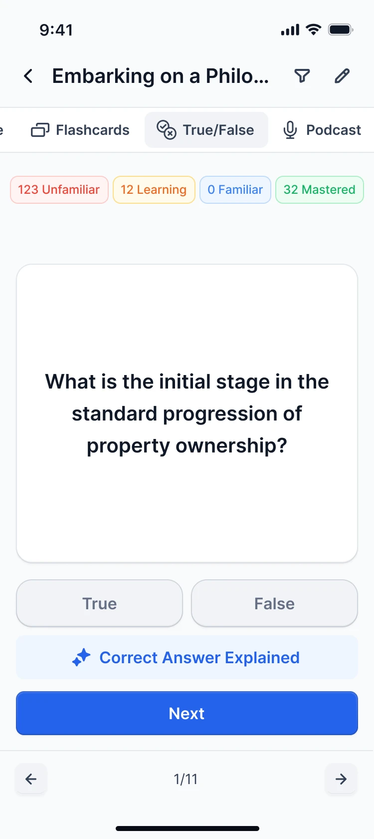
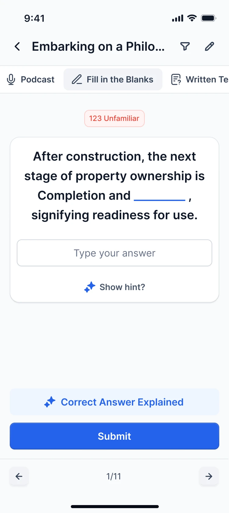
The Study Hub is built to bring students back. From one task or an uploaded lecture it generates notes, multiple choice, flashcards, true/false, a podcast, fill in the blanks and written tests. Every set tracks what is unfamiliar, being learned, familiar or mastered.
Paywall A/B test
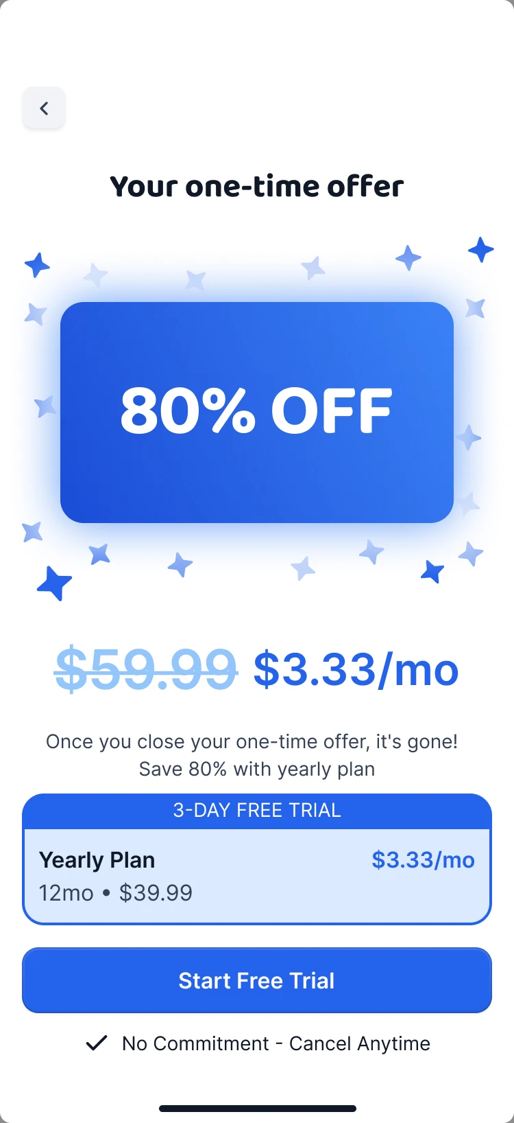
All of Classology's revenue goes through the paywall, so we didn't guess. We designed two complete funnels and compared them on live users through Superwall. It ships paywall variants without an app release, so an answer takes days instead of a release cycle.
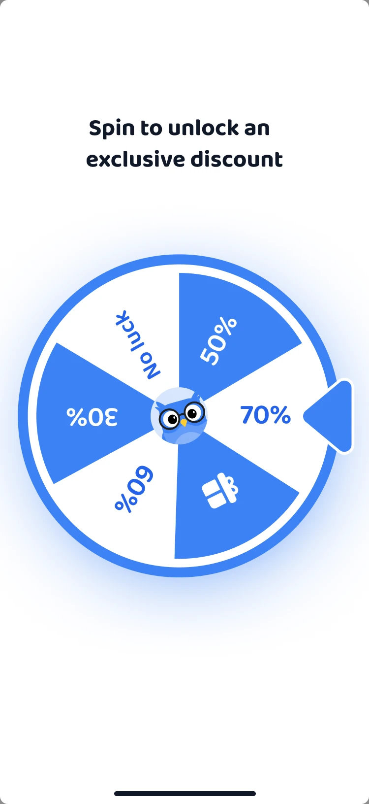
I argued for the Spin branch. My read was that the barrier to a subscription is the fear of being charged without noticing, and a strong discount only works once that fear is gone.
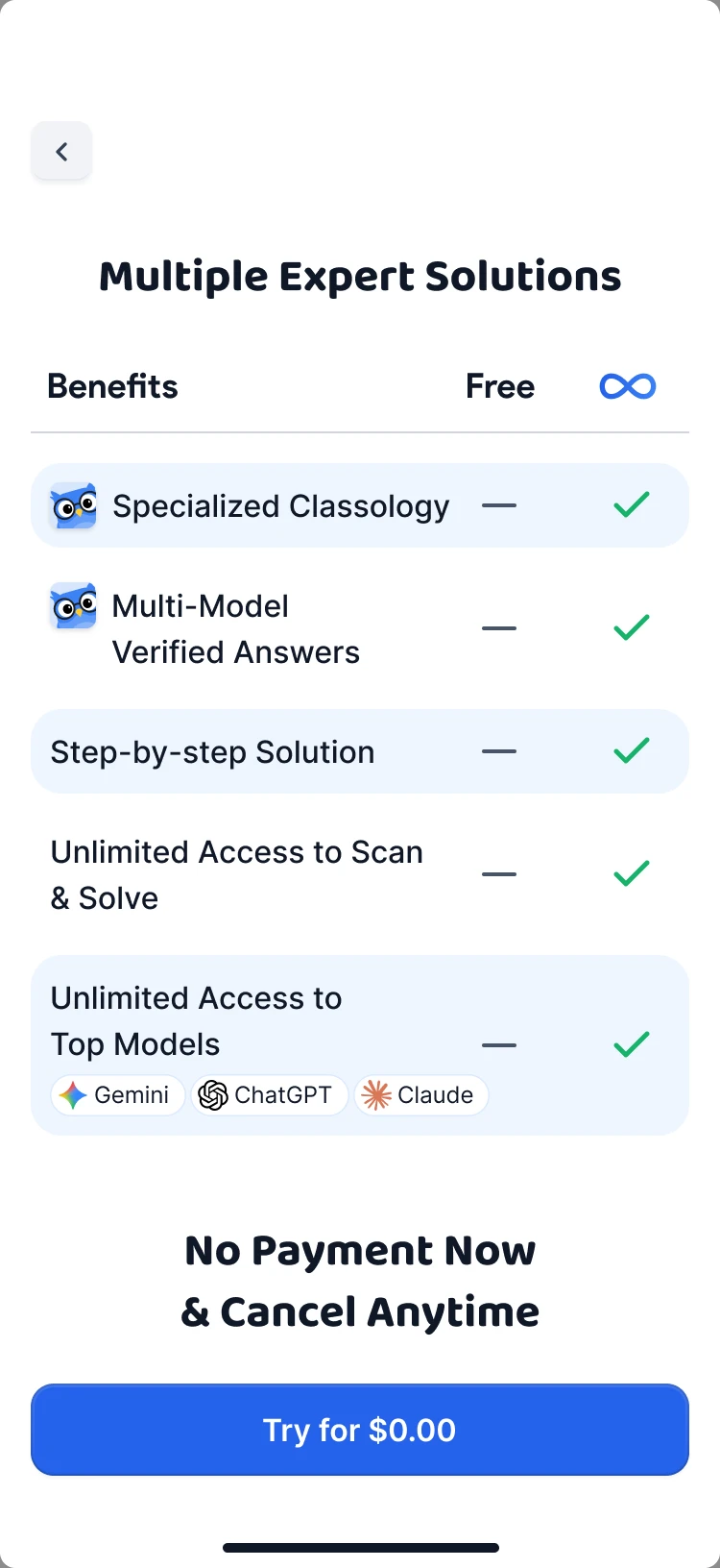
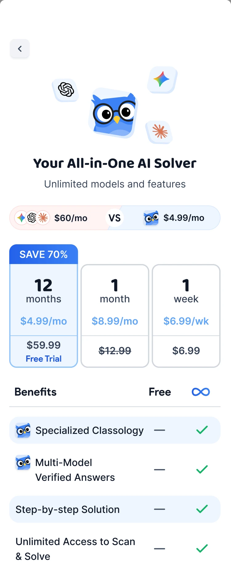
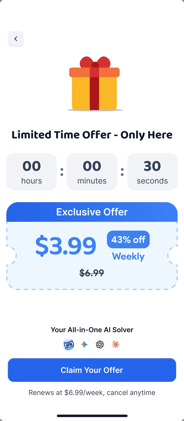
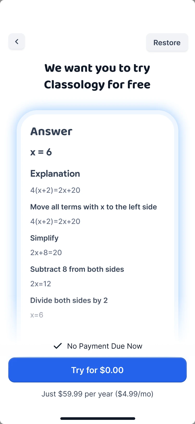
- Plan at the offer
- Billing
- Discount
- Trigger
- Before the offer
The hard part was the metric. The branches sold different plans, and a week for $3.99 almost has to win on conversion while it can still lose on revenue. So before launch I fixed the decision metric: conversion to payment, checked against revenue per user and the plan mix.
- Revenue per user
- Trial to paid
- Early cancellations and refunds
I specified the event tracking for every step of both funnels. The FAQ questions on the paywall were tracked one by one and gave a list of objections before payment, such as whether a school can detect the extension.
Results
- 0 → 1
- Mobile app built next to the extension
- 100K+
- Chrome extension users, the research channel
- 7
- Study formats from one solved task
- 2
- Complete paywall funnels tested on live users
Spin won and shipped. The explanation matched the bet: the longer path removed the fear of being charged first, and a prepared user takes the 80% offer. Superwall stayed in the product, and every later paywall iteration ran through it.
Beyond the test, Classology grew from a screenshot solver into a study product: one loop from the answer to the explanation and on to study material.
“Vlad was the lead UI/UX designer I worked with on Classology. I provided the product direction and design references, and he brought them together into polished, cohesive designs in Figma. I appreciated his ability to translate my ideas and feedback into a clear visual experience. I was very happy with his work and would gladly work with him again.”
Daniel Arzouman, CEO, Classology
What I'd do differently. Separate the variables. The branches differed in the plan, the billing, the discount and the path before the offer, so we learned which funnel is better. Which part of it did the work stayed open.