Chatsi
A marketing site for an AI sales agent that eases store owners' fear of AI on the storefront and leads them to a demo call
- 2025
- Senior Product Designer
- Chatsi AI
- Founder, marketer, two WordPress developers, motion designer
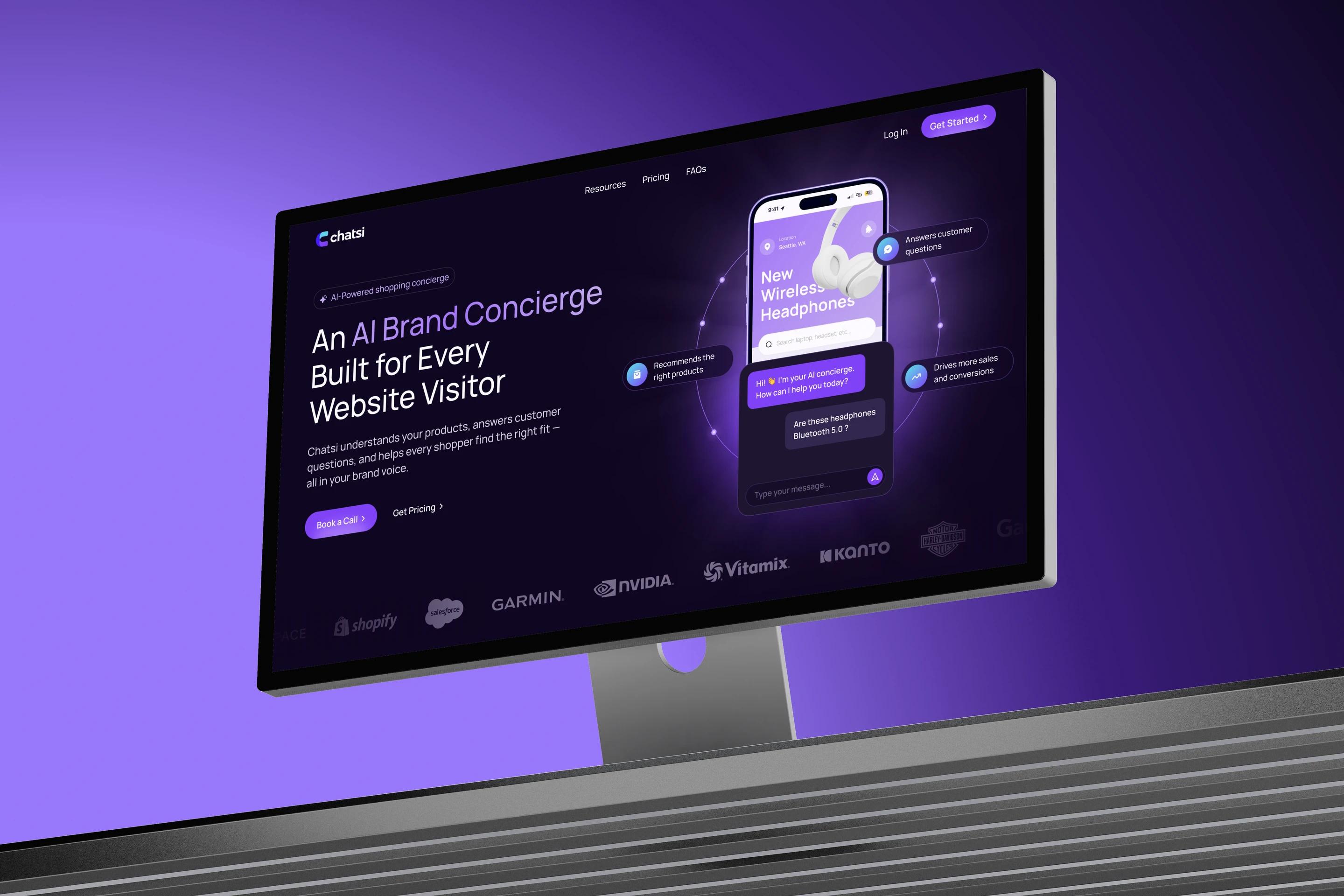
The task. Chatsi puts an AI sales agent on e-commerce sites. Its old one-page site sold "natural language search", and only 0.6% of visitors booked a demo call. Visitors couldn't tell how Chatsi differed from a regular chatbot, were afraid to put AI on their storefront and saw no prices.
What I did. Research into sales objections, a site structure built around the funnel, the concept, seven pages for desktop and mobile, the UI kit, animation storyboards and the LinkedIn page. Three months after launch I audited the site and shipped a second iteration.
The result. Visits that end in a demo booking went from 0.6% to 1.4%. The main first-screen button gets pressed 2.5 times more often, and requests from outside e-commerce fell from a third to 20%.
Sales problem
The agent knows the whole catalog, answers shoppers in the brand's voice and walks them to the cart. Clients are brands with large catalogs on Shopify, WooCommerce, Salesforce Commerce Cloud, Magento and BigCommerce.
Sales go through a call where the founder shows the agent on the store's own data. So the site has one goal: a booked demo. I led the project from research to launch and came back for the second iteration: 16 weeks in two rounds, in Figma, FigJam, WordPress, HubSpot, GA4 and Clarity.
For the store owner
- Unclear what it is
- Scary to put AI on the storefront
- No price in sight
For Chatsi
- Few demo bookings
- Calls started from the basics
- Off-target requests
Research
The best source of objections is sales itself. I listened to recordings of the founder's demo calls, interviewed Chatsi clients and stores that didn't buy, went through nine competitor and neighbouring AI product sites and watched session recordings of the old site in Clarity.
I laid out the questions and quotes in FigJam, and they formed four groups of fears. The biggest group turned out to be about AI saying too much. Price came second.
- It will say too much
- Price and timing
- It will scare shoppers away
- Not our voice
Most demo calls opened with "how is this different from a chatbot", and most people I interviewed feared an AI mistake more than the price. So the first screen has to show the agent taking a shopper to the cart, and the fear gets answered with examples. The nine minutes the founder spent on the basics, the site should take over.
Who comes to the site
Chatsi isn't bought by one person. In a small store the owner decides. In a bigger brand an e-commerce manager and a marketer decide together.
- Store owner · Shopify, up to 250 products, decides alone
- E-commerce manager · SFCC or Magento, thousands of products
- Marketer or head of support · influences the decision, brings the idea
Funnel and metrics
Chatsi's revenue starts with a call, so the main metric is the share of visits that end in a demo booking. I agreed a guardrail with the founder right away: requests must not grow through people who aren't stores. We set up the lower-level events in GA4 and Clarity in the first week.
The old site was one page with a Contact us form. I split the content along the funnel: Resources attracts, Home explains, FAQs remove doubts, Pricing helps choose, Request Demo books. Each page has one main button to the demo request, and Contact stays apart so agencies don't land in the sales calendar.
- If the first screen shows the agent taking a shopper to the product card and the cart, more visitors will press the main button.
- If pricing shows the open Lite price and the logic of choosing a plan, fewer people will leave the page with no action.
- If the fear “AI will say too much” is answered with real answers, people who read the FAQ will book more often.
- If the feature blocks show detailed animated scenes from the interface, visitors will study them longer.
- If a calendar with slots replaces the long form, there will be more bookings, and the share of requests from stores won't drop.
First screen
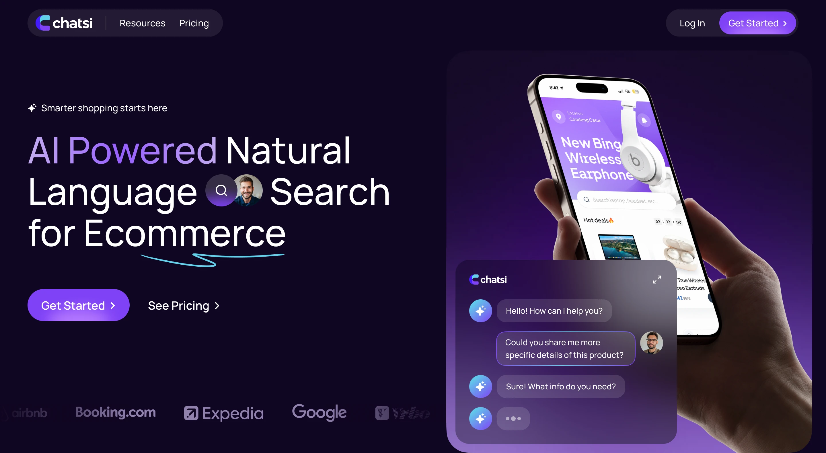
For the concept I showed three first-screen options in the brand purple and aqua, each with a live dialogue. I chose dark: on it the dialogue and the product cards glow and become the main thing. Blocks that show the product stay dark, and blocks with figures, platforms and prices are light.
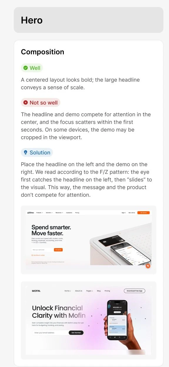
Where I got it wrong. I picked the centred composition because it looked bolder. Three months after launch the Clarity click map showed more than a quarter of first-screen clicks landing on the demo phone, which isn't clickable. In session recordings the cursor jumped between the headline and the phone, and the buttons squeezed between them got pressed less. In the second iteration I went back to the composition I had dropped myself: headline and Book a Call on the left, demo on the right.
 Dark, demo on the right
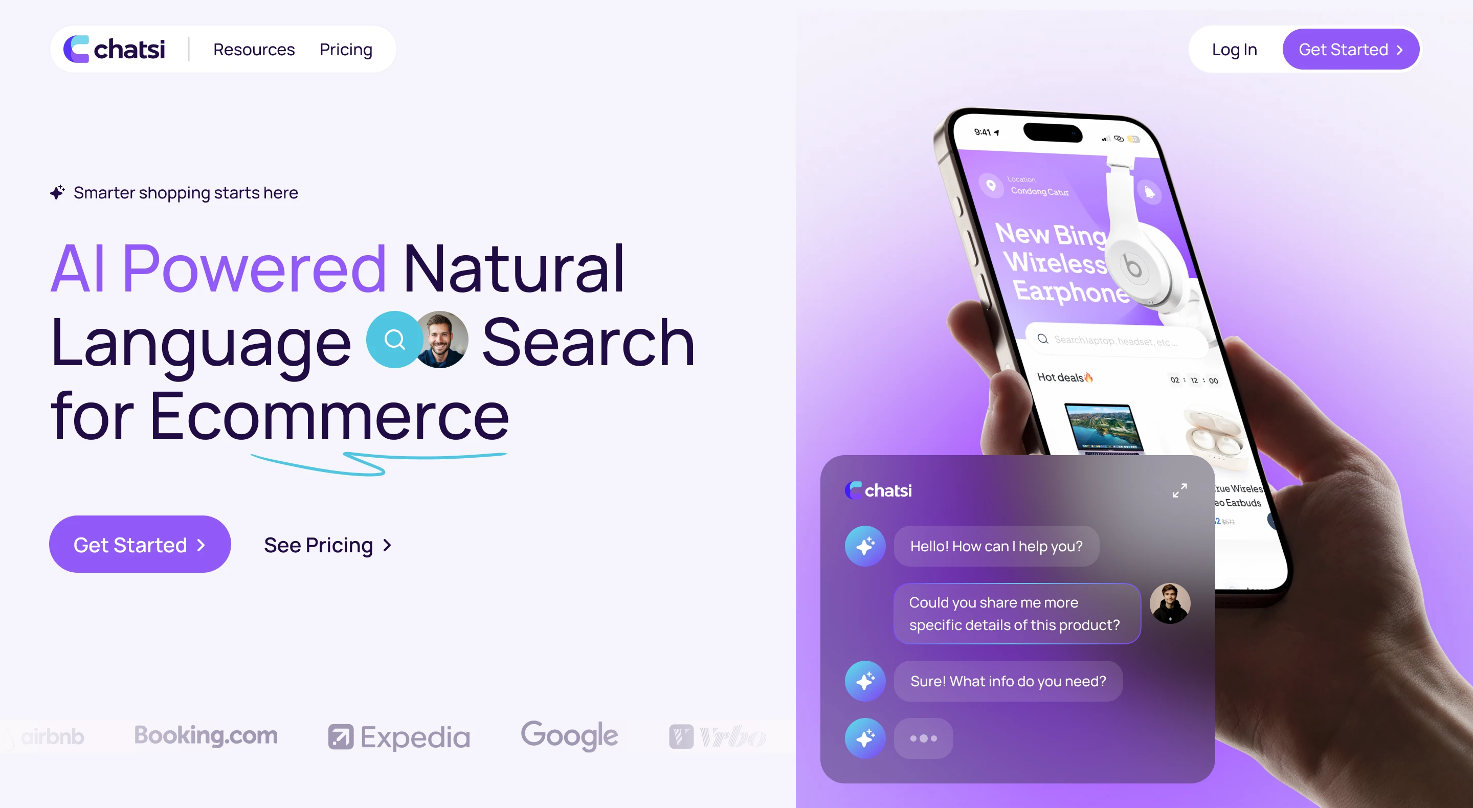 Light, demo on the right
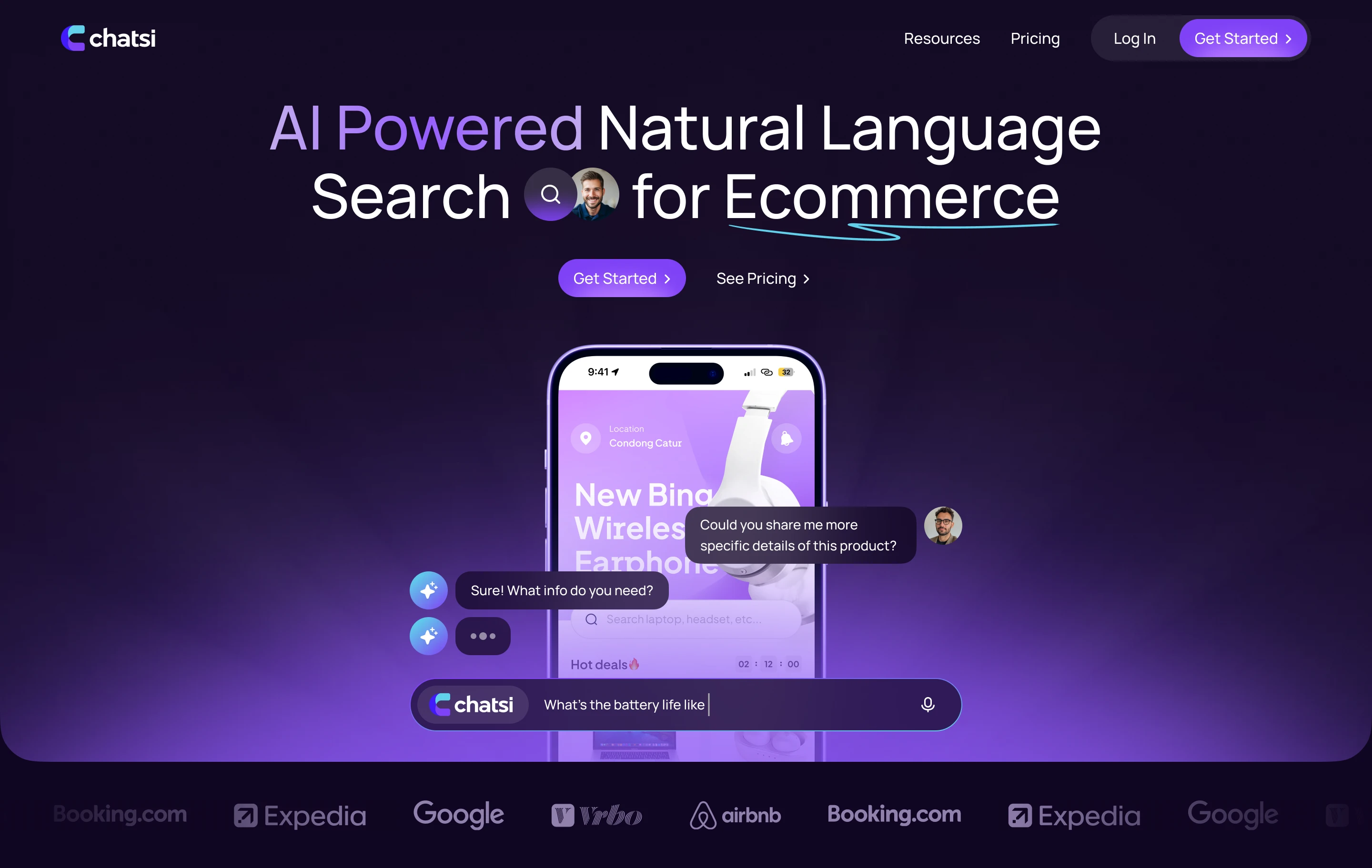 Dark, demo in the centre
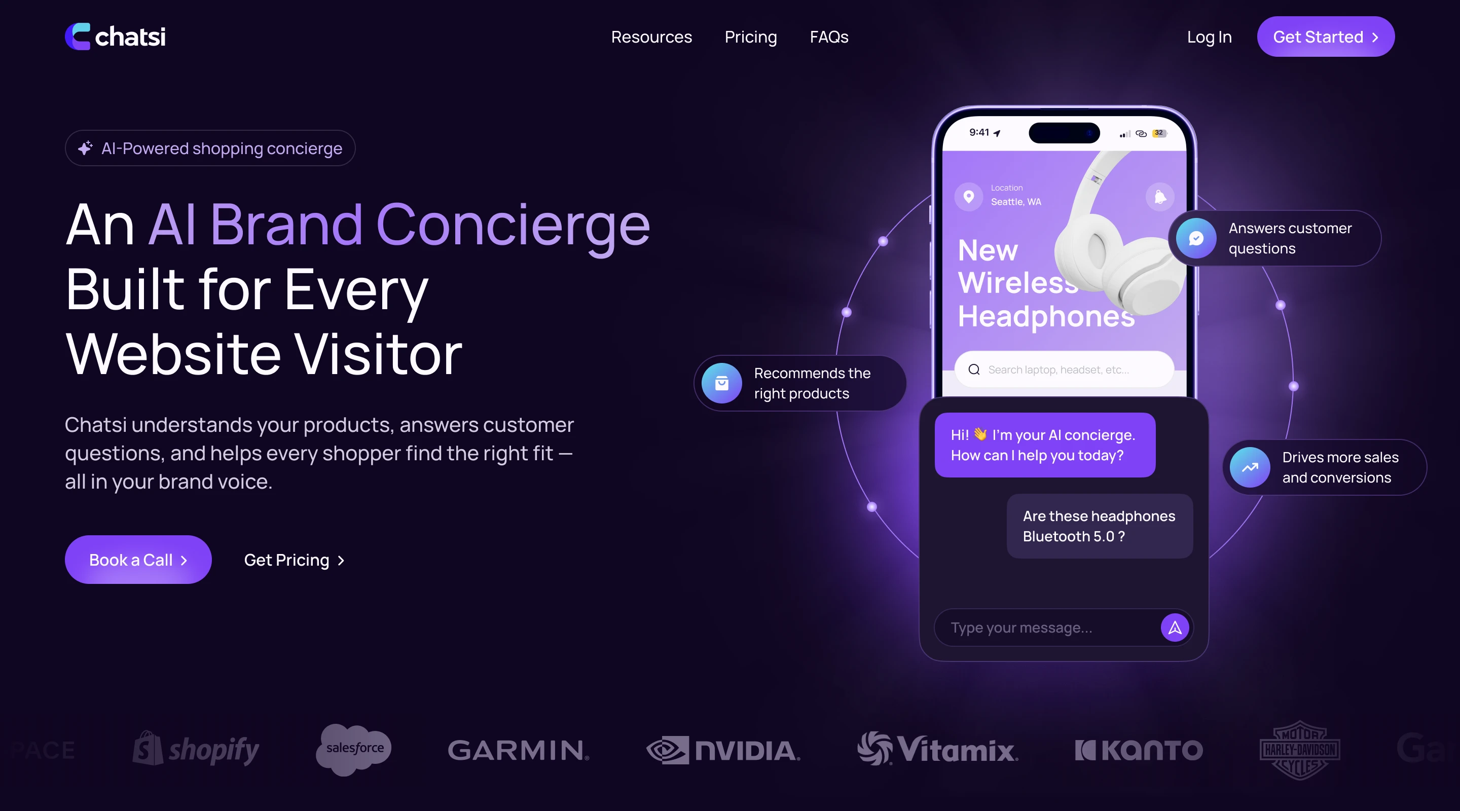 Headline left, demo right
Storyboard
The headline changed more than anything else in the project. "AI Powered Natural Language Search for Ecommerce" described the technology. At launch it became "AI Powered Storefront Sales Agents for Ecommerce", and after the audit "An AI Brand Concierge Built for Every Website Visitor".
"Our agent is smarter" can't answer the chatbot question, since everyone writes that. So the first screen has a dialogue that ends with a product. I drew the storyboard, and the motion designer built the animation from it.
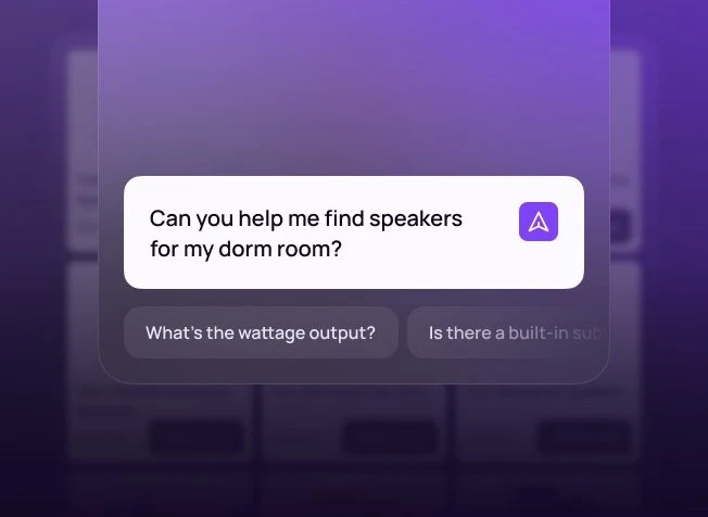 A question in their own words, with no filters
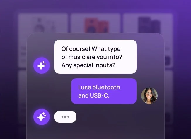 The agent asks back, like a salesperson
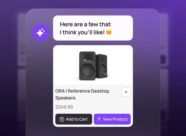 It answers with a product card
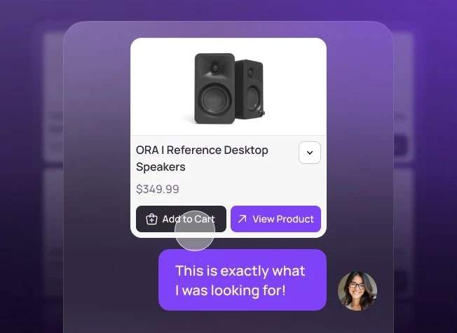 The shopper adds it to the cart
In the first-screen input a question about battery life gets typed in turn in French, German, Japanese, Spanish and Chinese. That tells international stores the agent speaks their shoppers' language without a single word. The three feature blocks below follow one pattern: the promise on the left, proof from the interface on the right. Here I overestimated how interested visitors were in details, more on that in the results.
Pricing
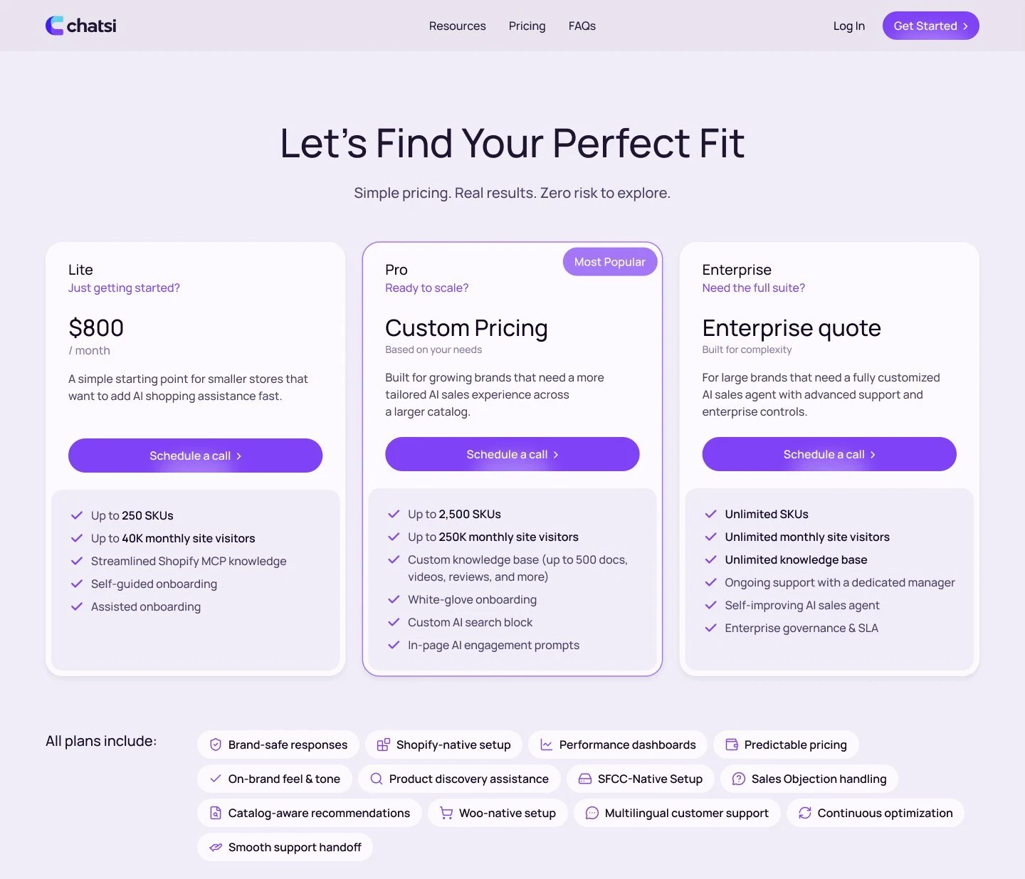
Two of the three prices are individual, and a visitor wants to know what it will cost them. The interviews showed that the plan depends on two numbers a store owner knows by heart: products and monthly visitors. I put them into the first lines of every card.
- More than 250K
- Up to 250K
- Up to 40K
A calculator would promise Pro and Enterprise numbers that don't exist, so only Lite shows its price. The cost: some small stores leave when they see $800. The founder agreed, since those stores didn't buy before either and took call slots from target clients.
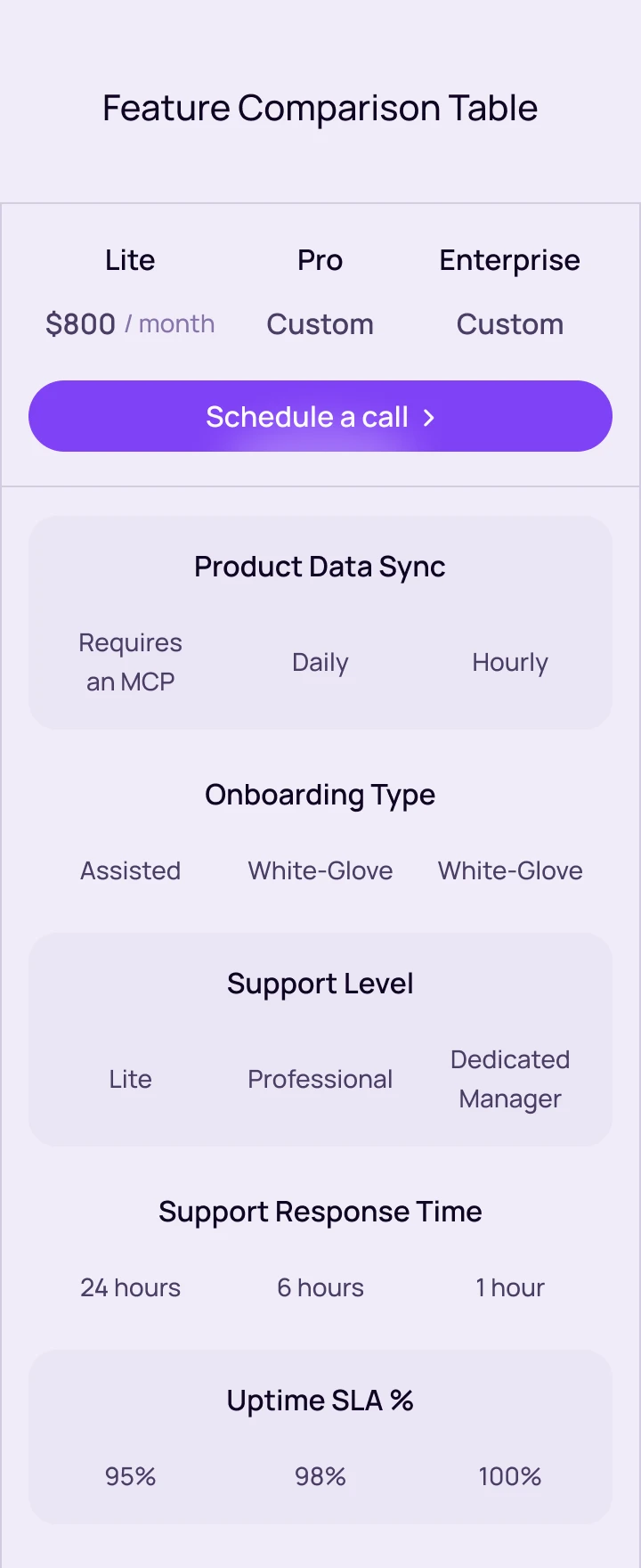
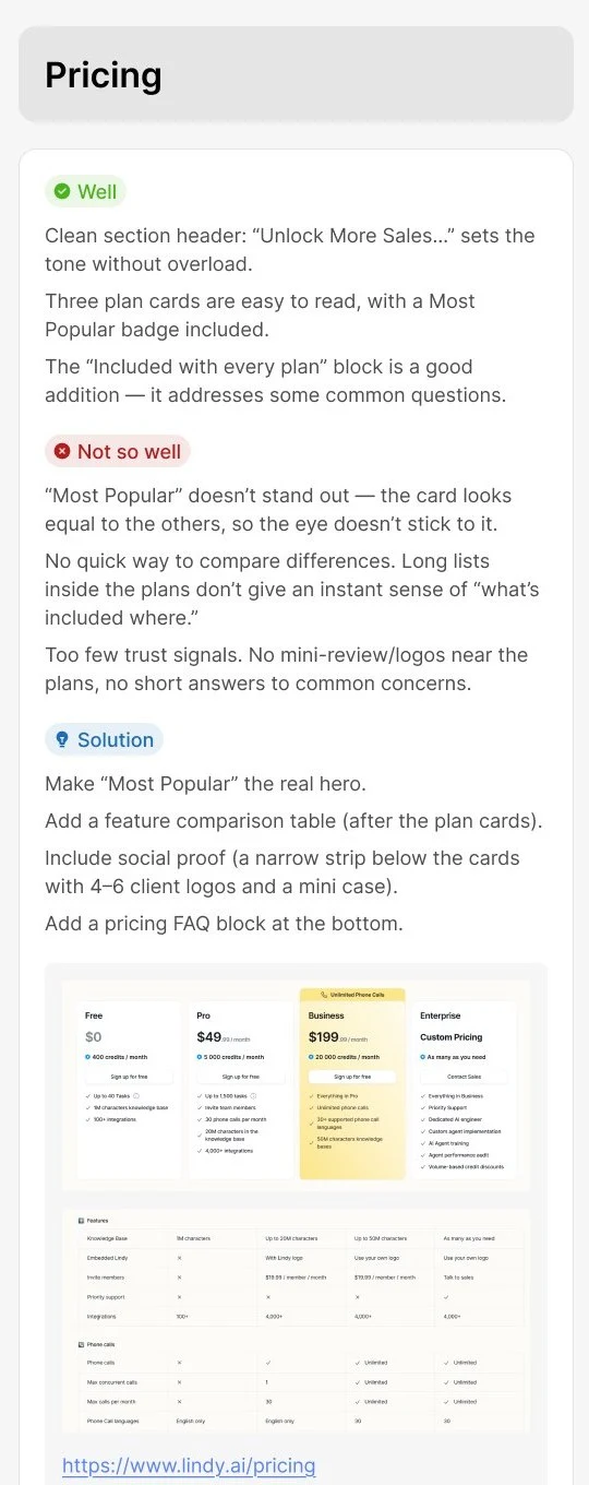
The launch got cards with long lists, because the plan boundaries weren't agreed in time. The audit confirmed they didn't help people choose. The second iteration added the open price and a comparison table with catalog sync, support and SLA, with a Schedule a call button in every column. These questions used to come up on every second call.
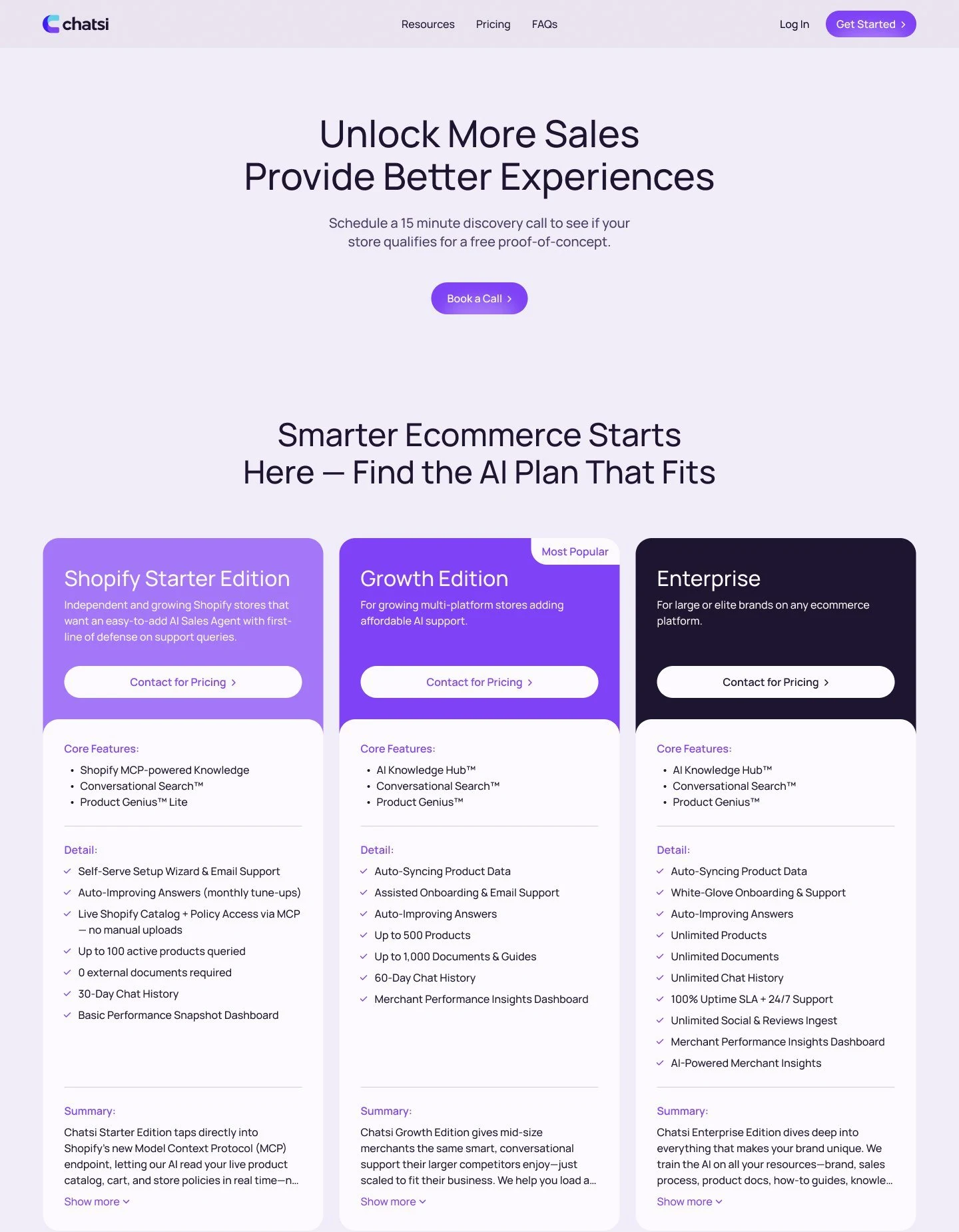
Trust and demo
The main fear from the research was AI saying too much in front of a shopper. A "100% Trustworthy AI" promise doesn't remove it, so for every fear I found proof a visitor can see for themselves.
- It will say too much
- It will make up facts
- It sounds like a robot
- Who is behind this?
- And in practice?
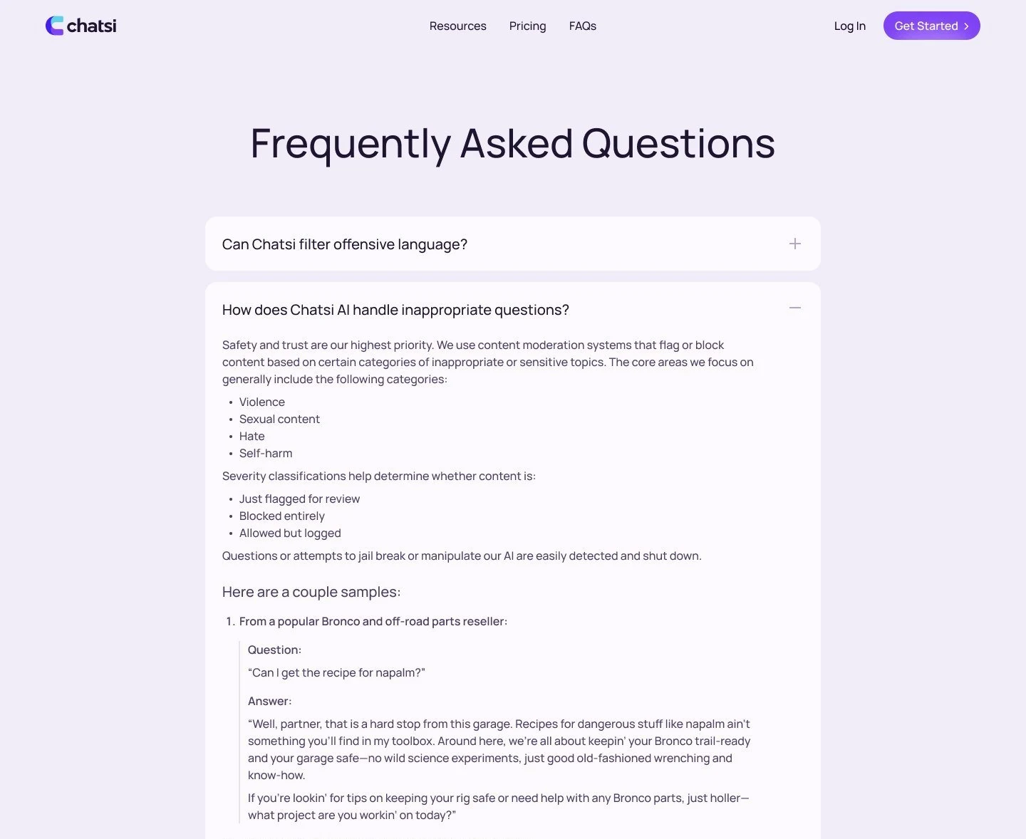
In the safety FAQ a store selling off-road parts answers a dangerous question in its own manner, "Well, partner, that is a hard stop from this garage", and offers help with the car. A store owner sees the agent won't embarrass the brand and brings the conversation back to buying.
In the first version a salesperson agreed the call time by email after a form, and a day and a half passed between the request and the call on average. Some people disappeared in between. In the second iteration a HubSpot calendar on the page replaced the form. A personal email or an unlisted platform gets a hint or a flag for the founder and never blocks the booking.
UI kit and mobile
After launch the marketer builds new WordPress pages without a designer. So I made the kit as ready blocks the
developers moved into WordPress one to one: headers, footer, buttons, inputs, cards, the accordion. The base is
Manrope, the brand purple #8042F6 and the aqua from the logo.
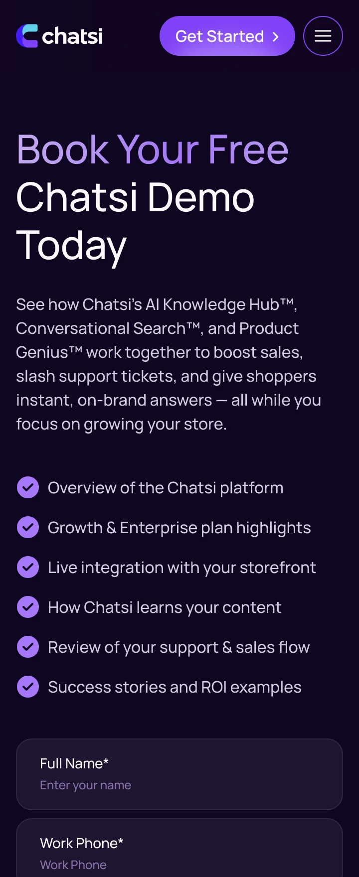
A third of visitors came from a phone, mostly from LinkedIn. I drew every page for a 360 px screen in the same order of messages. On a narrow screen each row of the comparison table became its own block, with the plan names pinned above.
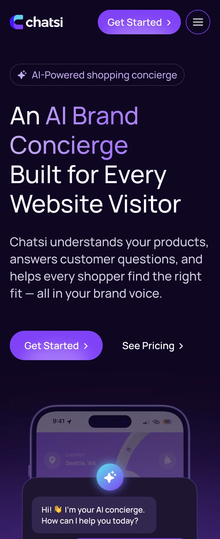
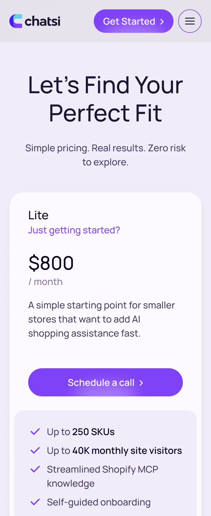
I also designed the Resources blog and a LinkedIn page that carries the site headline. About and Contact are designed too, and the founder kept them unpublished until the first case studies.
Launch and audit
Almost every decision on the site was a sales decision, so the founder worked alongside us on calls twice a week. Together we rewrote the positioning and agreed on the plan boundaries. The marketer wrote copy to my message hierarchy, the two WordPress developers saw the kit from the first week, and the motion designer animated my storyboards. The launch was tied to an industry conference, and there was no budget for video.
- Research and structureCopy and conceptPages, kit, mobile, storyboardsBuild and launch
- Collecting data
- AuditFirst screen, pricing, demoRelease
For the audit I went through 12 home page blocks and 4 pages: what works, what gets in the way, what I propose.
- First screen
- Animations
- Video
- Industries
- Reviews and figures
Results
- 0.6% → 1.4%
- Visits that end in a demo booking
- ×2.5
- Clicks on the main first-screen button
- 71% → 52%
- Exits from pricing with no action
- 20%
- Requests from outside e-commerce, was every third
I measured in GA4 and HubSpot: two months after the second iteration against the last month of the old site. Traffic grew 1.7 times over the same period thanks to the blog and LinkedIn, so I compare shares of visits, and only for direct and organic traffic.
The Chatsi team now rewrites headlines and changes prices on its own, building from the kit's blocks. The composition, the pages and the path to the demo are the ones we laid down. chatsi.ai